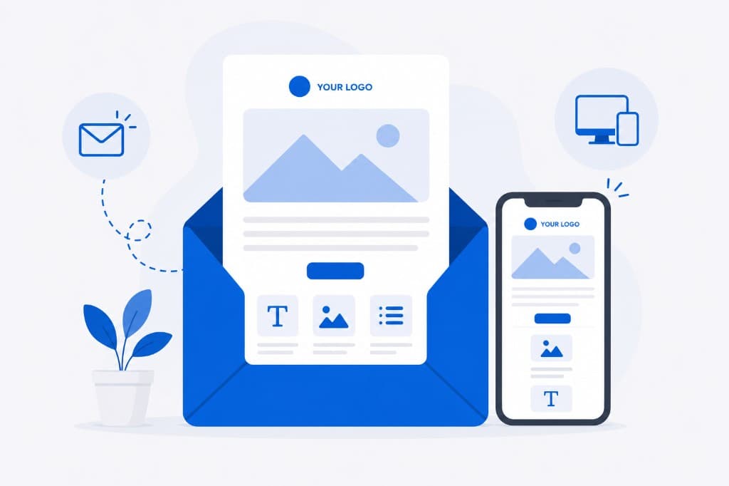
A responsive email displays correctly whatever the screen size, so the recipient can read it even on the small screen of a phone. Here are a few tips that help.
How to create good quality email messages?
-
Make sure the email looks good on all devices, whatever the screen resolution.
-
Put the main offer in the right place, which is the upper left corner. The content of an email is usually displayed in blocks placed one after another, so putting the offer there means recipients pay more attention to it.
-
Encourage people to read the whole message and not only the headline. Mentioning what’s inside right at the beginning works well. You could also add a bonus, like a promo code or a piece of advice on how to deal with some problem. The recipient will then scroll through the message to see what they can get.
-
Keep the content short. A few sentences are usually enough to get the important things across. It shows people you value their time, and they’ll be more likely to read what you send next.
-
Pay attention to the CTA buttons and check that they actually work. You want the email to have some effect, which often means somebody going to your website and subscribing to a service or buying a product, and the buttons are what get them there. It’s best if they’re at least 29x44 px, which is comfortable to tap.
-
Leave some extra space between the CTA button and everything around it, so it’s easier to click.
-
Look at the pictures you’re putting in the email. You don’t want the graphics stretched out or badly rendered. People pay more attention to visuals than they do to written text, so the image quality is worth getting right.
Keep these tips in mind when you’re writing and building your emails, and don’t forget to test them. It’s better to spend a bit longer checking that everything works than to send out an email that doesn’t hold up.
How to make emails responsive?
- The recommended message width is
600-650px. - The height or length of the email can’t exceed
400kb. - The graphics must be in png or gif format.
- Use a one or two-column template layout.
- Use verbal image signatures.
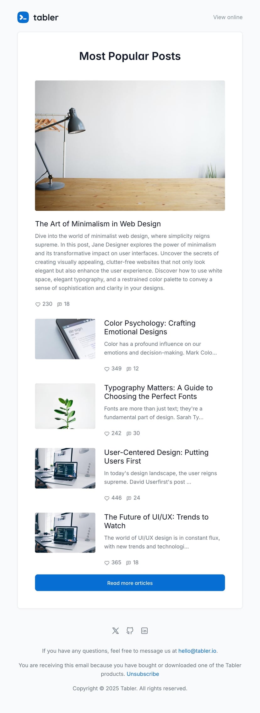
- The template must include a header, main text and a footer.
If you don’t have the time to build your own email templates, you can use the ready-made ones from Tabler Emails. It’s a set of over 80 responsive and customizable email templates, tested thoroughly and ready for mobile.