Icon Design Guide
Icon Design Principles
To maintain the high quality and consistency essential for the Tabler Icons collection, designers and contributors are advised to adhere to the following detailed guidelines:
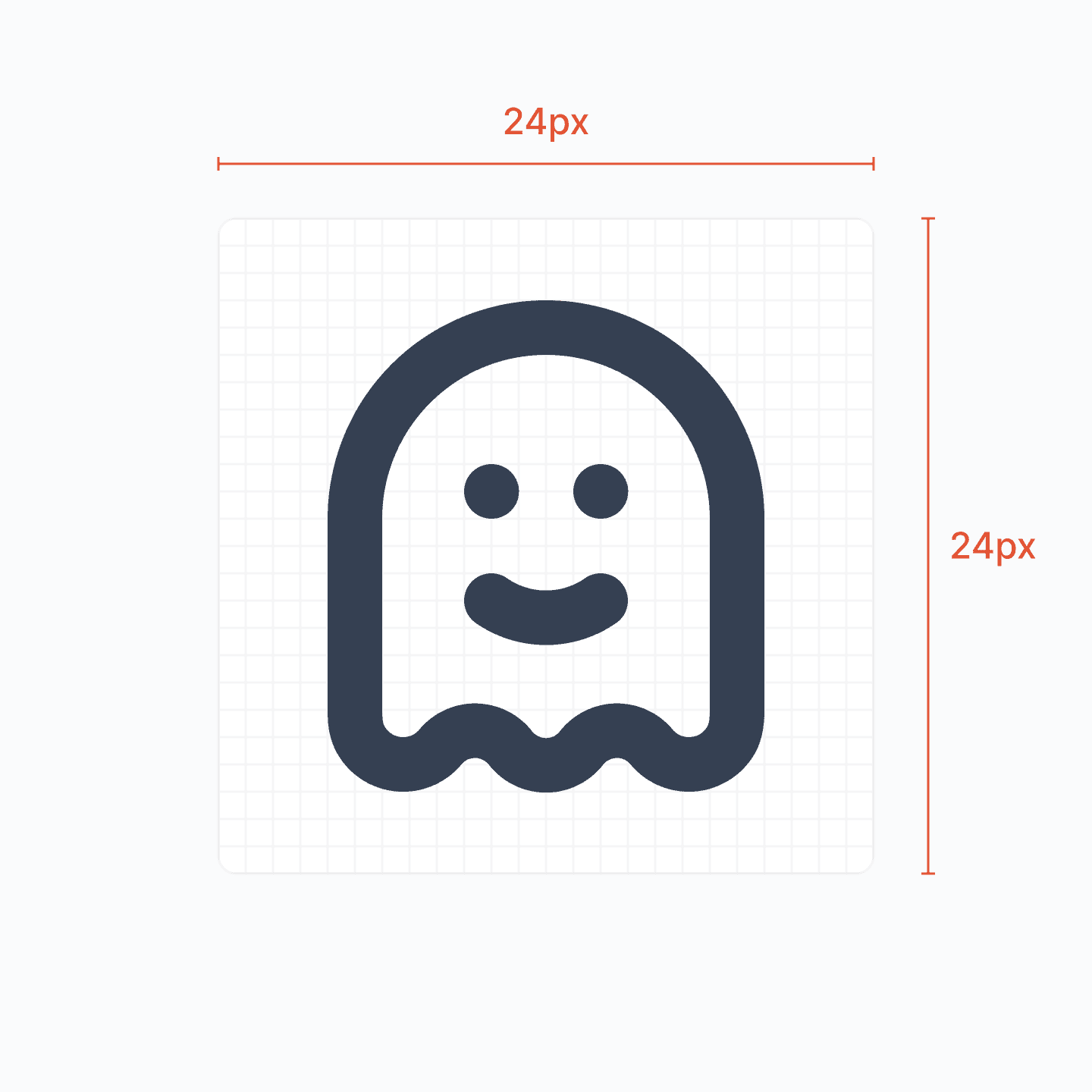
1. Icons must be designed on a 24 by 24 pixels canvas.
Icons must be designed on a 24 by 24 pixels canvas to ensure uniformity, scalability, and visual coherence across the collection. This canvas size is the standard for most icon sets and is the most widely supported size for web and mobile applications.
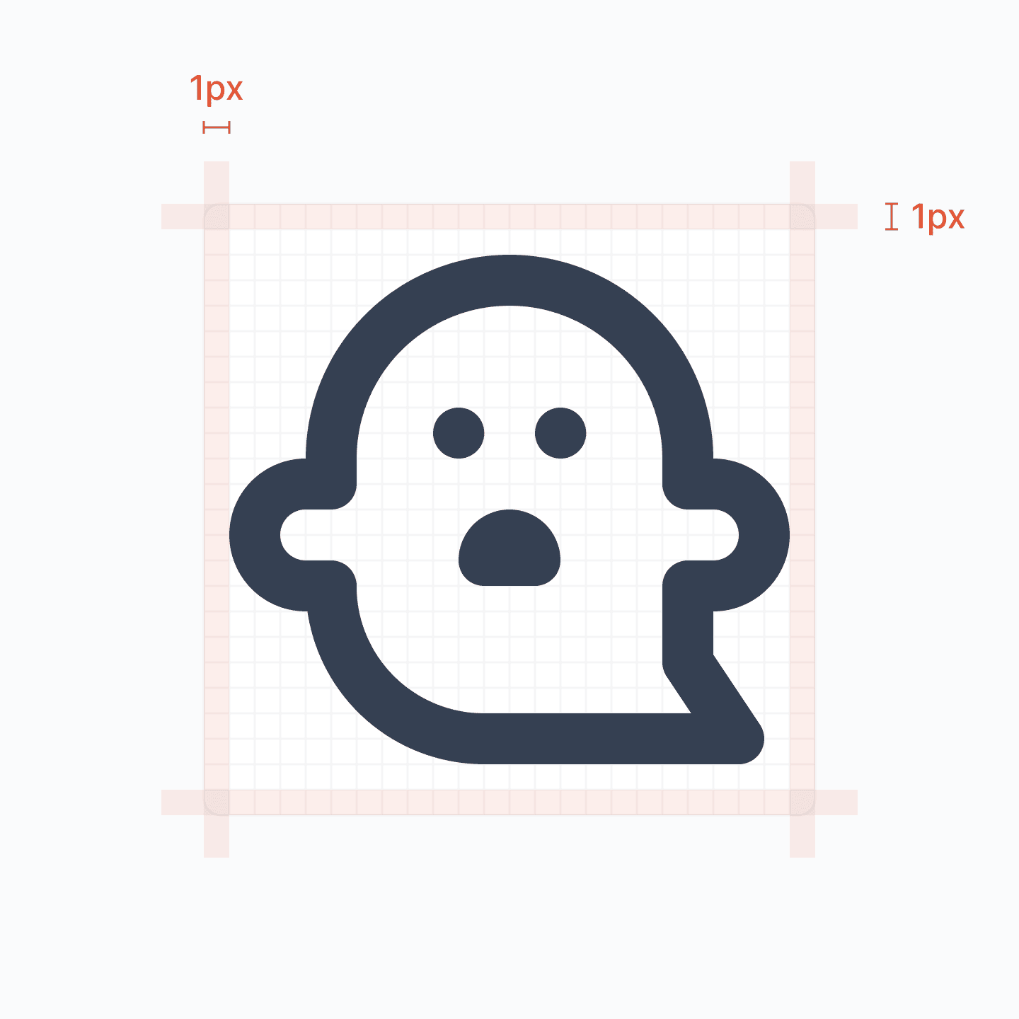
2. Icons must have at least 1 pixel padding within the canvas.
To maintain clarity and prevent visual clutter, icons should include a minimum of 1 pixel padding around their design elements within the canvas, ensuring adequate space between the icon’s edge and its container.
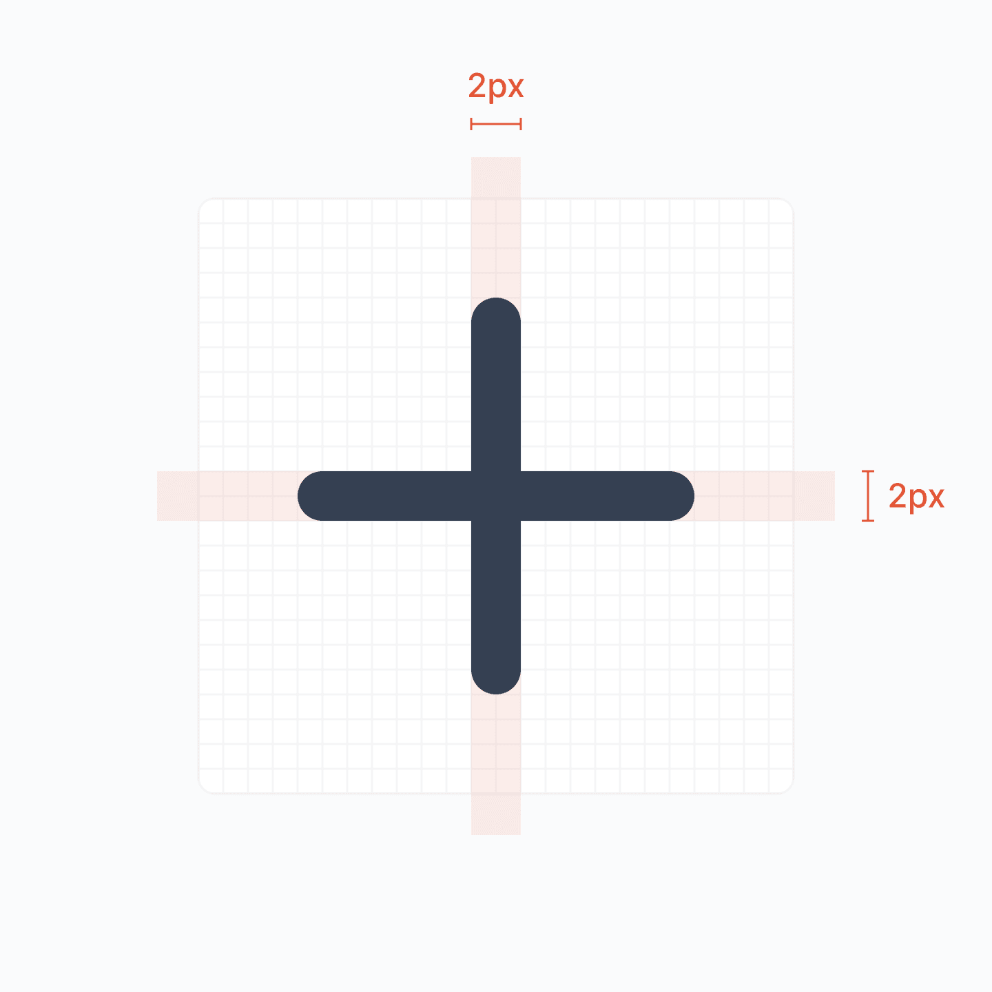
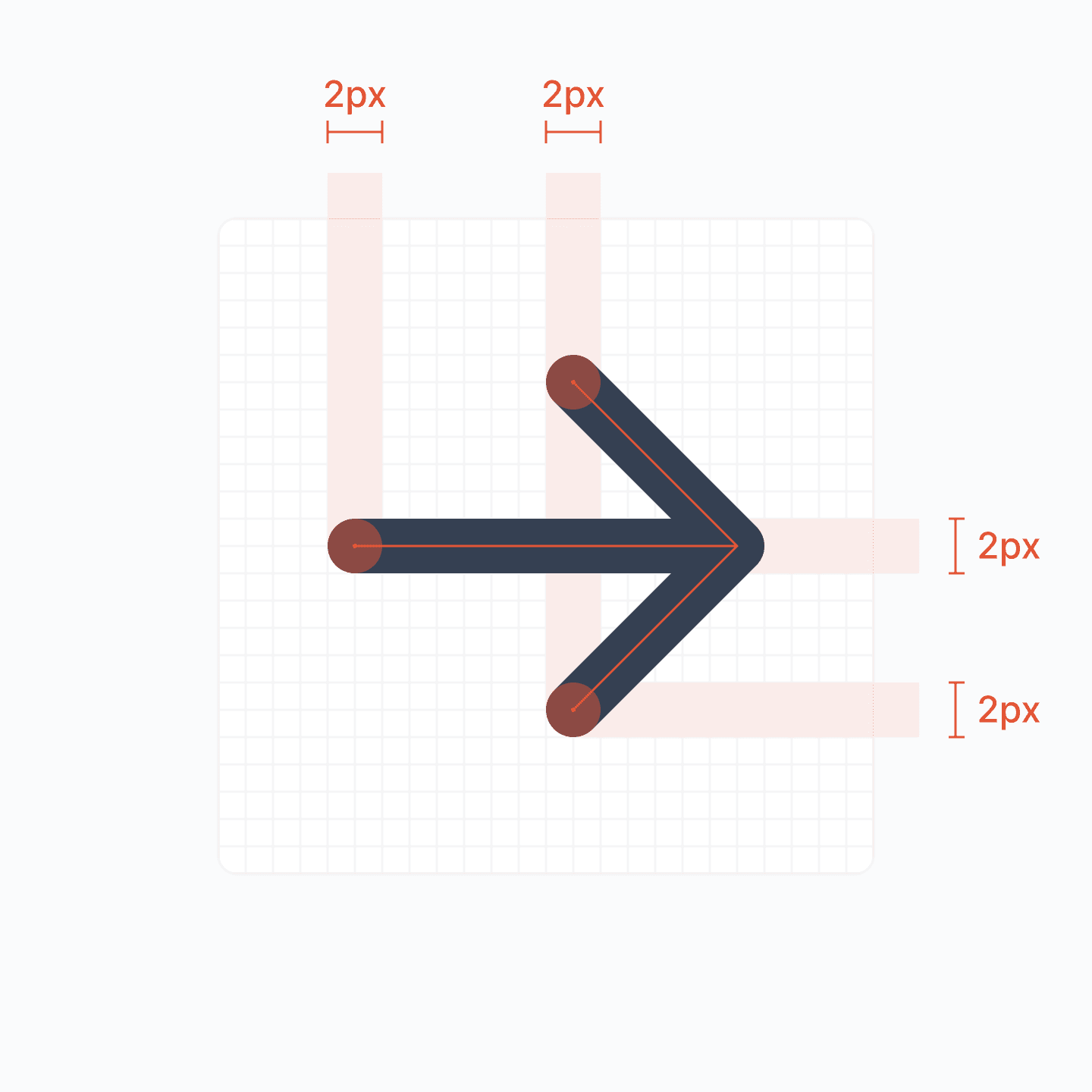
3. Icons must be designed with a 2 pixels stroke.
Icons should be crafted using a 2-pixel stroke width to achieve a balanced and consistent line weight throughout the icon set, enhancing visual harmony and readability.
4. Icons must use round joins.
Icons should employ round joins to ensure smooth transitions and a cohesive aesthetic across all connecting lines and curves, enhancing the overall visual appeal.
5. Icons must use round caps.
Icons should feature round caps at the ends of lines to create a friendly and approachable look, ensuring a uniform and visually appealing design across the collection.
6. Icons must use centered strokes.
Icons should be designed with centered strokes to ensure symmetry and balance in the visual representation, enhancing clarity and consistency across the icon set.

7. Shapes (such as rectangles) must have a border radius of 2 pixels.
Shapes within icons, like rectangles, must incorporate a 2-pixel border radius to soften corners, promoting a cohesive and modern aesthetic throughout the icon set.
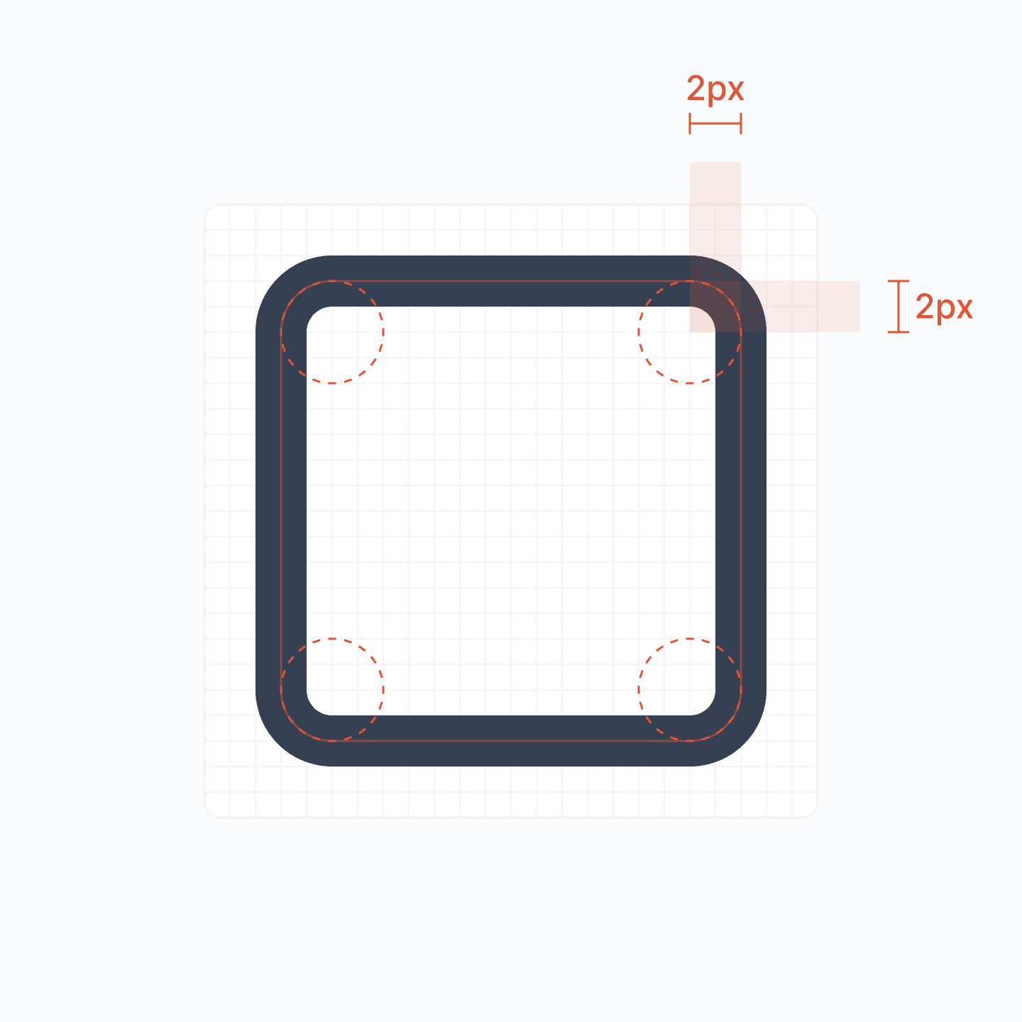
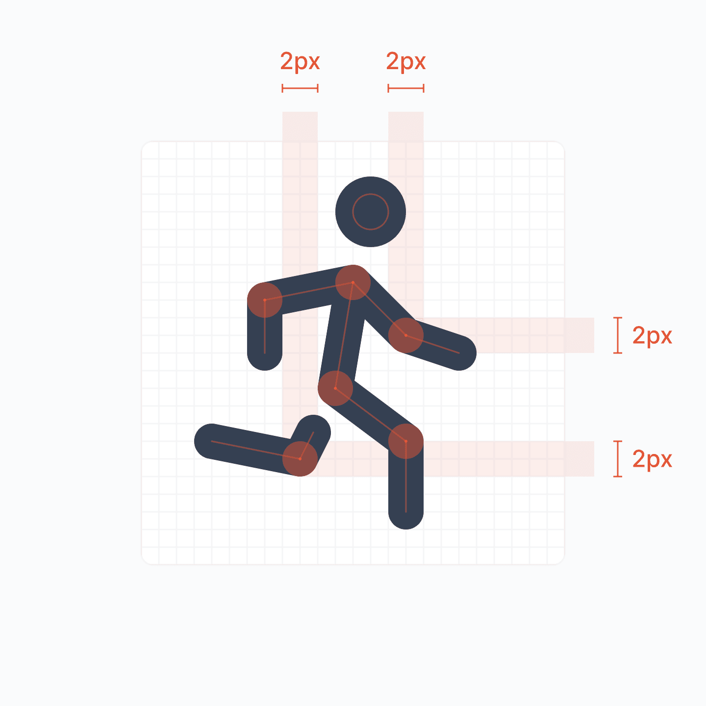
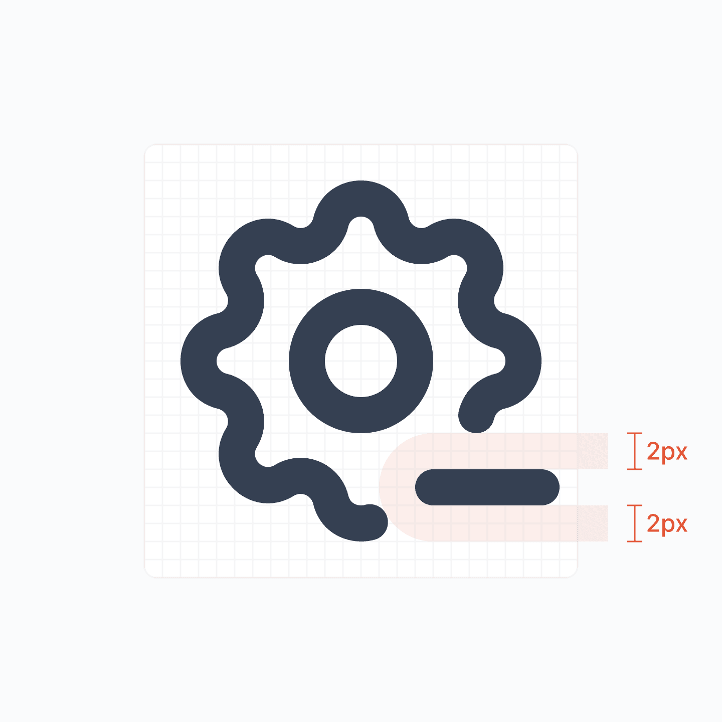
8. Distinct elements must have 2 pixels of spacing between each other
Distinct elements within icons must maintain a 2-pixel spacing between them to ensure clarity and visual separation, enhancing the icon’s legibility and aesthetic appeal.
9. Ensure icons have high contrast for better accessibility.
Consideration should be given to accessibility, ensuring that icons are distinguishable and usable by people with various types of visual impairments. This includes adequate contrast ratios and clear differentiation between icons.