A responsive email displays correctly regardless of the screen size, so the recipient is able to read it even on a small screen of their mobile phone. Take a look below to find a few tips that will help you create responsive emails.
How to create good quality email messages?
-
Make sure the email looks attractive on all devices, regardless of the screen resolution.
-
Put the main offer in the right place, that is in the upper left corner, as the content of an e-mail message is usually displayed in blocks placed one by one. Thanks to that, the recipients will pay more attention to the message.
-
Encourage the recipients to read the entire message and not only its headline, for instance by mentioning what it contains at the beginning. You may consider adding a bonus, such as a promo code or a piece of advice on how to deal with an issue. The recipient will then scroll through the message to see what they can get.
-
Make sure that the content is concise - a few sentences is enough to share the most important information. Thanks to that, you will show users that you value their time, increasing the chances that they will read your messages in the future.
-
Pay attention to the CTA buttons and check if everything works correctly. It’s very important that the emails you send bring the desired effect, which often means going to your website and subscribing to a service or buying a product. That’s why, you need to make sure that the buttons let users do so. Also, it’s best if they have at least 29x44 px to ensure maximum comfort.
-
Leave extra space between the CTA button and other elements, to make the button easier to click.
-
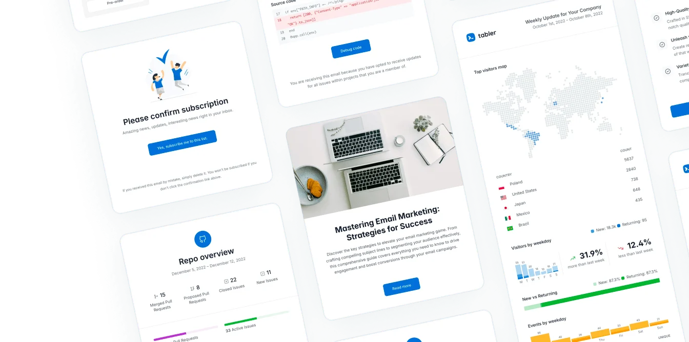
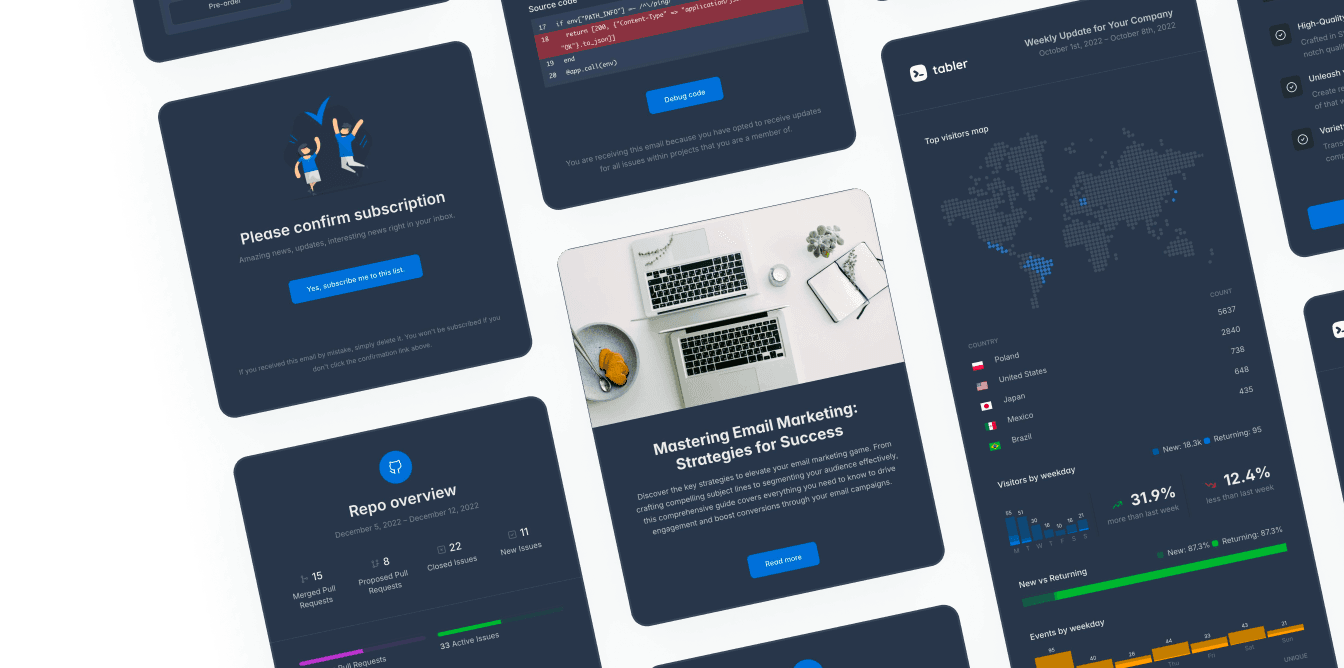
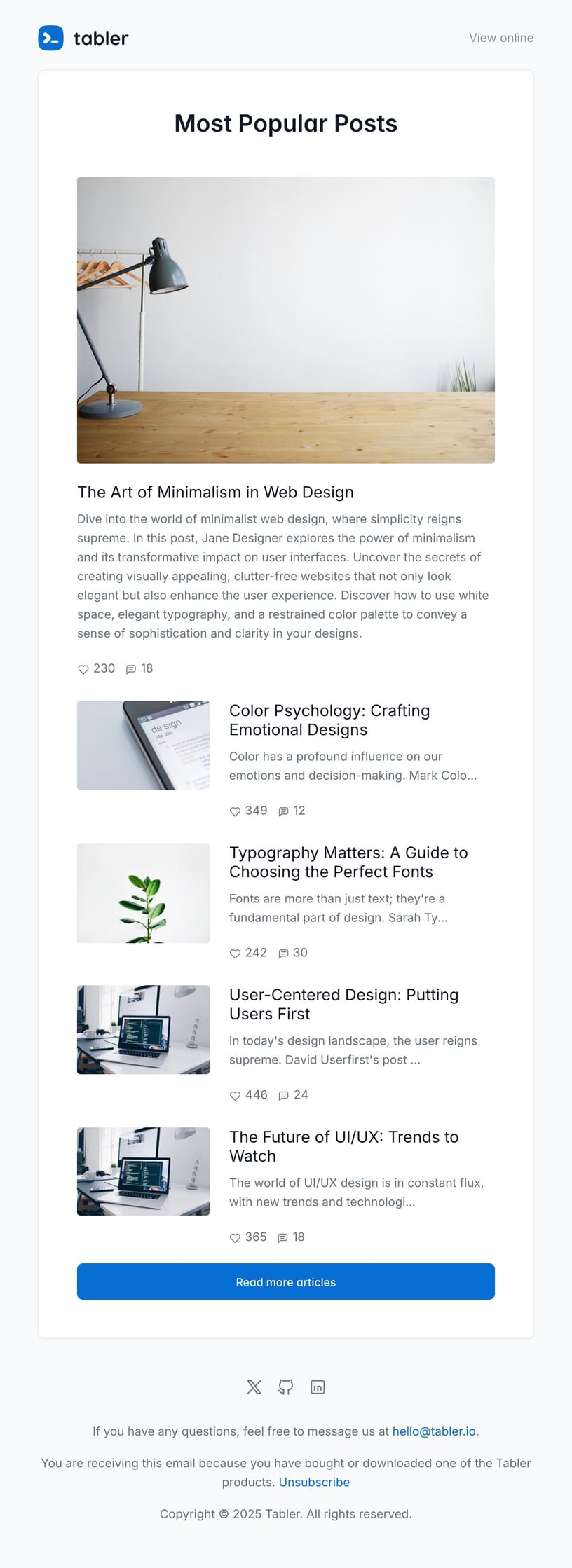
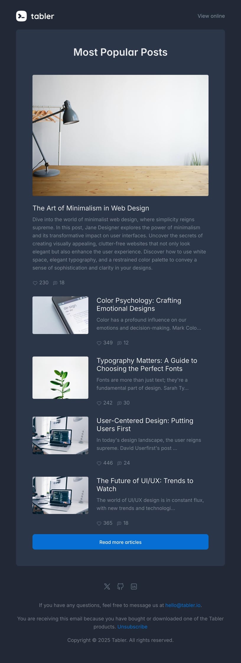
Look at the pictures you include in the email. You don’t want your graphics to stretch too much or be bad quality. Make sure that the image quality is optimal, since people pay more attention to visuals than they do to written text.
Keep the tips in mind when creating and writing your emails and don’t forget to test the messages. It’s better to spend more time checking that everything works fine than to send an email that doesn’t meet the required standards.
How to make emails responsive?
- The recommended message width is
600-650px. - The height or length of the email can’t exceed
400kb. - The graphics must be in png or gif format.
- One or two-column template layout should be used.
- Verbal image signatures should be used.
- The template must include a header, main text and a footer.
If you don’t have time to create your own email templates, you can use ready-made email templates by Tabler Emails. It’s a set of over 80 responsive and customizable email templates, thoroughly tested and mobile-ready.