Tabler v1.6 is here, with eight new components and lighter CSS
Tabler 1.6 is out. It has eight new components, a new datepicker, a neutral gray scale, colors defined in oklch() and a focus ring that's drawn as an outline. And tabler.min.css is about 110 kB smaller.
Tabler 1.5 was mostly about the layout. It brought the folded sidebar and the Customize panel, and it moved Bootstrap into the Tabler source tree.
1.6 is more about components. There are eight new ones, five of the old plugins became real components, and the CSS got quite a bit lighter. You also don’t need to change anything in your markup to upgrade.
The full changelog lists every commit. Here I’ll just go through the bigger changes.
Datepicker
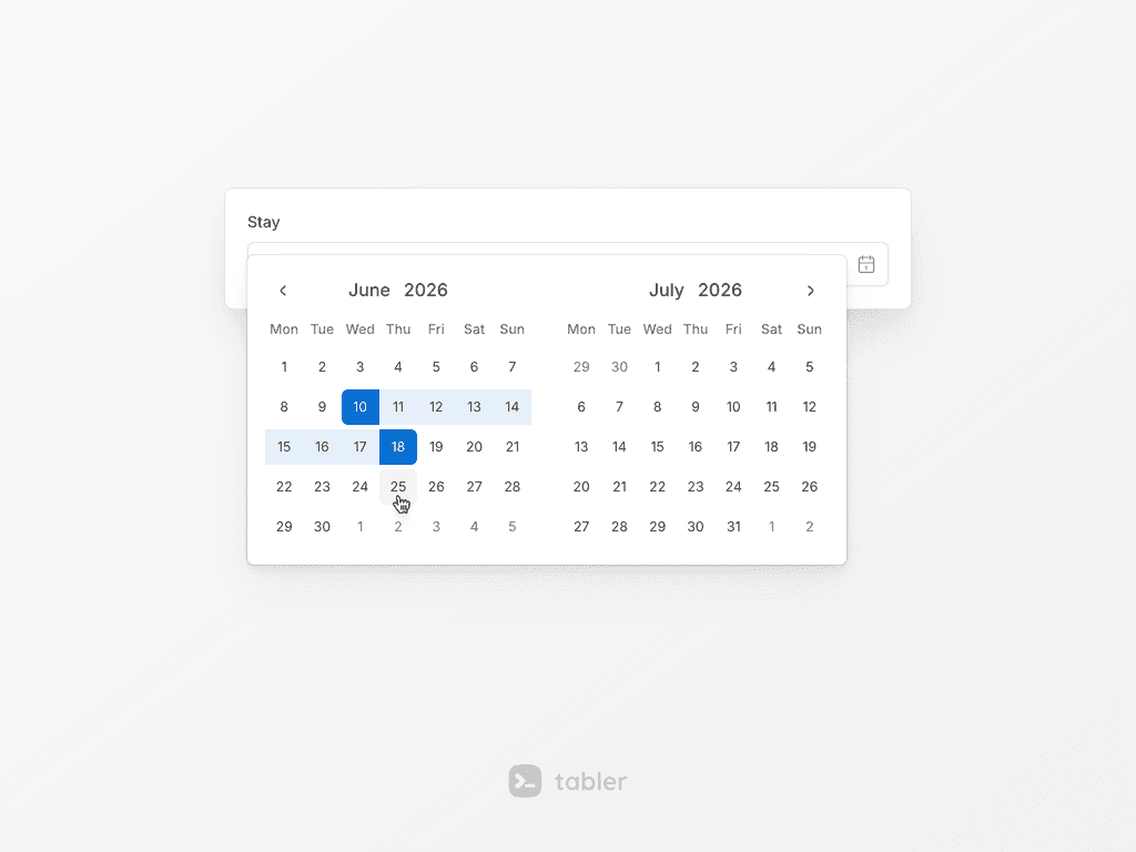
Almost every admin panel has a date field somewhere, and until now Tabler used Litepicker for it. The new Datepicker can open as a calendar popup from a text input or a button, or sit inline on the page. It works with a single date, with several dates and with a range.
It’s built on Vanilla Calendar Pro, so Litepicker is now deprecated. If you’re using it, the docs have a section on moving over.
Sparkline
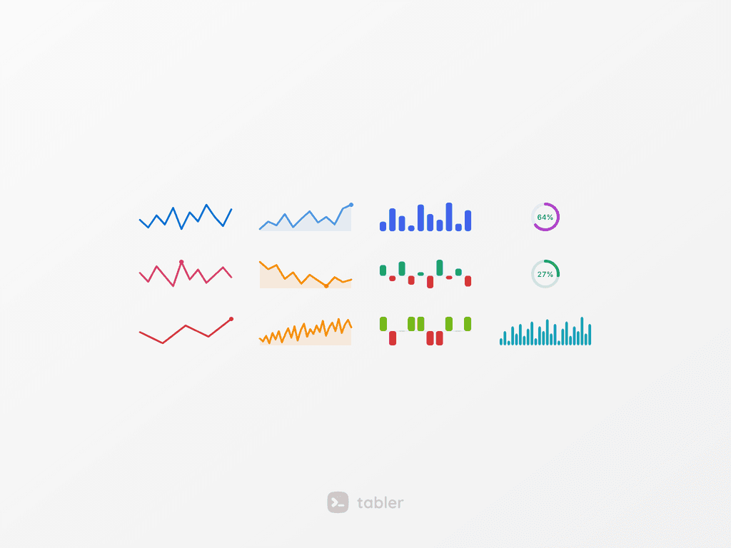
Sometimes a full chart is too much, and all you want to show is that a number is going up. Sparklines are tiny line, bar and circle charts that sit inline with text. They work well in a table cell or next to a KPI.
The chart is an SVG rendered from data-bs-values, so you don’t need a chart library for it. It takes its color from the text utilities and its size from classes. Bars can also be signed, which is handy for gains and losses.
Legend and Signal
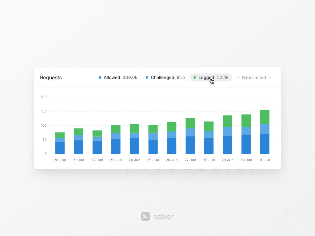
.legend used to be just a colored dot. Now it’s a whole legend item, with a marker, a label and an optional value. You can use it for the series of a chart or for a progress bar.
Items can be grouped with .legend-list. There’s also an interactive mode, where clicking an item toggles its series. And .legend-lg shows a big value with a unit, which looks nice above a chart.
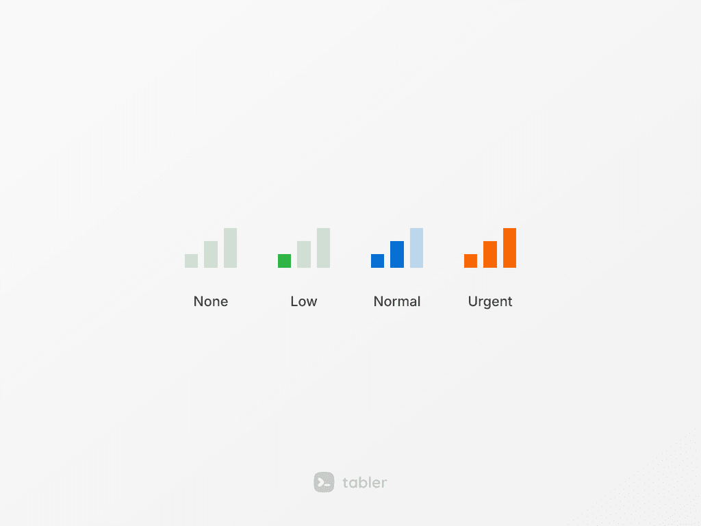
Signal (.signal) is a small row of stepped bars that shows a level. That can be a priority, a strength or coverage, for example. You can change the number of bars, the color and the size.
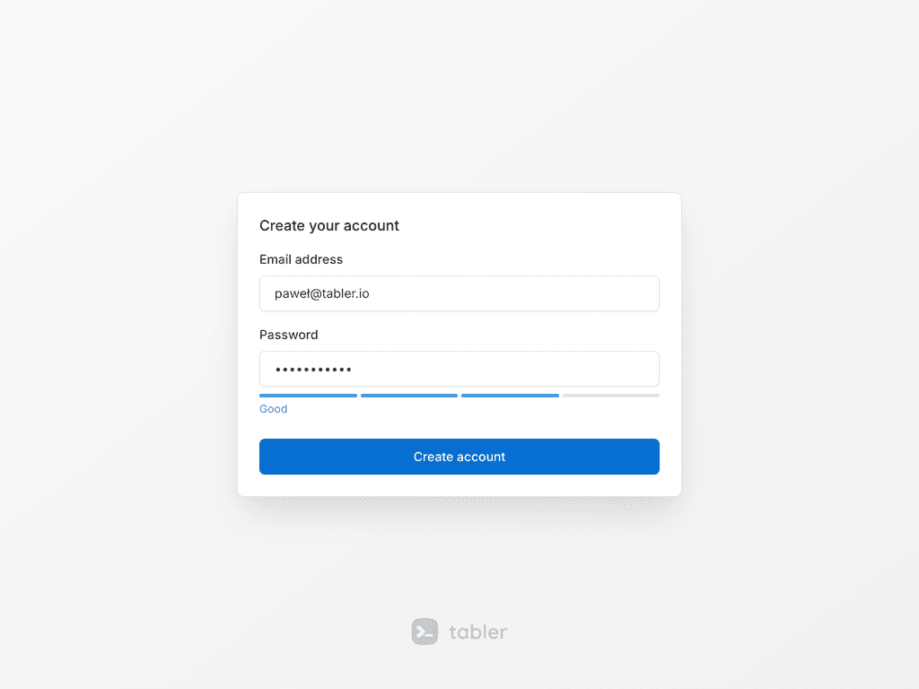
Password strength and OTP input
The Strength meter rates a password while the user is typing it. That way a weak password is visible before the form gets sent. You can configure the scoring and the labels, and every change fires change.bs.strength.
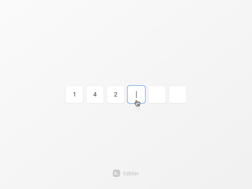
The OTP input shows a one-time code as separate character slots. Underneath, it’s still one real input. So autofill, password managers, SMS codes and screen readers keep working. The slots can be grouped and masked, and there are validation states too.
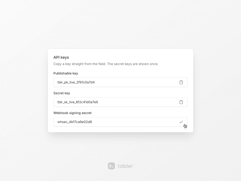
Clipboard and Confetti
Clipboard is a copy button. It can copy the text of a field, an element or a plain string, and it shows a short “copied” state afterwards. It uses the browser clipboard API and fires events, so the dist/libs/clipboard library is deprecated now.

Confetti is for the happy moments, like a finished setup, a first order or a new signup. You can put data-bs-toggle="confetti" on a button or call it from JavaScript. The amount, length, speed and colors are set with data attributes.
Plugins are components now
Autosize, CountUp, InputMask, Sortable and SwitchIcon are now real components, with instances, methods and events.
Autosize and CountUp were rewritten from scratch, so they don’t need their dist/libs scripts anymore. CountUp also respects prefers-reduced-motion.
Switch icon got a loading state. If you pass a promise to event.wait() in the toggle.bs.switch-icon event, the button shows a spinner until the promise settles.
Sortable has drag styles now. The demo shows a drag handle, table rows, a kanban board, clone, multi-drag and swap.
One more small thing. If one element on the page has an invalid data-* config, tabler.js now logs the error and still creates all the other components. Before, it just stopped.
Neutral gray, oklch colors and a real focus ring
The default gray scale is neutral now. In 1.5 it had a slight blue tint, so backgrounds, borders and muted text will look a little different. If you’d like the 1.5 look back, load tabler-themes.css and set data-bs-theme-base="gray" on <html>.
The palette is now defined in oklch(). Tints, shades and hover states are mixed with color-mix(in oklab) instead of rgba(). You’ll mostly notice it in the light backgrounds, which look a bit cleaner. The --tblr-*-rgb variables are deprecated, but they’ll stay until 2.0.
The focus indicator is a solid 2px outline now, instead of a box-shadow. It’s also easier to see in dark mode. You can tune it per component with --tblr-focus-ring-width and --tblr-focus-ring-color.
Floating navbar and offcanvas
.navbar-floating moves the navbar and the sidebar 0.5rem away from the edge of the screen. .offcanvas-floating does the same for an offcanvas. If you want the whole page to use it, set data-bs-navbar-style="floating" and data-bs-offcanvas-style="floating" on <html>.
A native <dialog> now gets the same backdrop as a modal. And when you scroll to the end of a modal or an offcanvas, the page behind it doesn’t start scrolling anymore.
About 110 kB less CSS
tabler.min.css is about 110 kB smaller than in 1.5.
Most of that comes from generating styles once instead of repeating them. The button, list group, pattern and color utility styles used to be generated for every variant. The vertical navbar used to be generated for every breakpoint. The flag, payment and social SVGs are minified now too.
If you build Tabler yourself, you can set $enable-deprecated: false. That leaves the deprecated aliases and the --tblr-*-rgb variables out of the CSS completely.
New in the demo and docs
The demo has a new billing page, a system status panel with 60-day uptime bars, gauge cards on the widgets page and a reworked charts page with sections and legends.
In the docs, component pages now have a CSS variables section. It’s generated from the source, so it won’t go out of date. There’s also a new Sortable page, and the upgrade guides now have one page per release.
Upgrading from 1.5
Your markup should keep working as it is. There are two things that can break a build, though.
First, 69 Sass color variables are color-mix() strings now. That includes the *-bg-subtle, *-text-emphasis and *-border-subtle families, among others. You can still override them. But if you call a Sass color function like darken() on their default value, it’ll fail. The fix is to build from the base color instead.
Second, the components are now compiled with strict TypeScript. If your project passes a loosely typed options object to a component, you may see new type errors. Nothing changes at runtime.
A few things are deprecated. .form-hint is now .form-text, and Litepicker, the $*-focus-box-shadow variables and a few Sass helpers are on the way out. All of them still work for now. The Upgrade to 1.6 guide has a before and after example for every change.
You can install it with:
npm install @tabler/core@latest
Get started with Tabler v1.6
If you want to see it in action, open the preview, read the upgrade guide or download the package.
We’d love to see what you build with it.