A dashboard rarely fails because a team can’t build a card or a button. It fails when the tenth screen looks unrelated to the first, when a data table breaks on a laptop, or when a rushed settings flow creates exceptions nobody planned for.
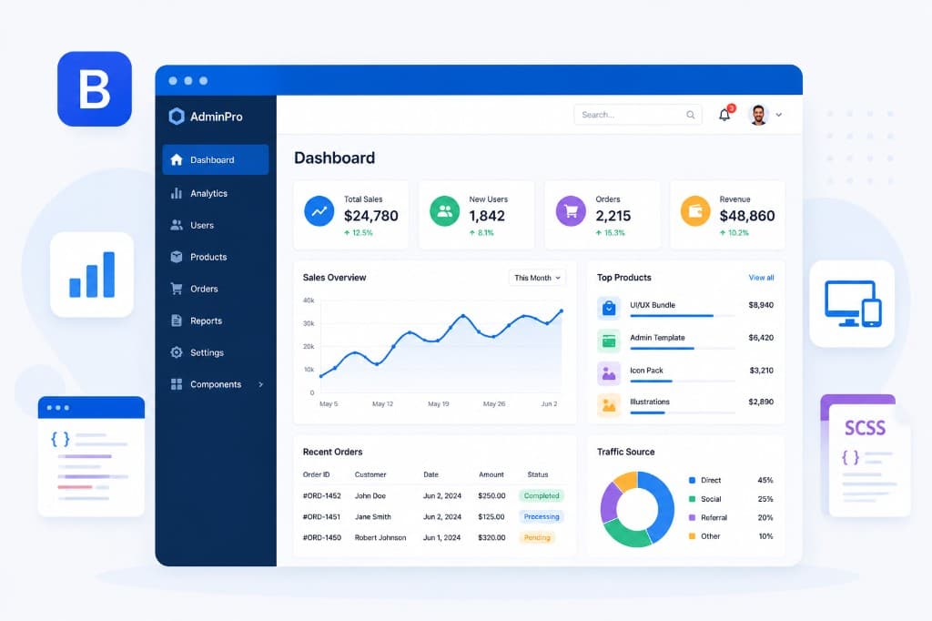
A good Bootstrap 5 admin dashboard template takes some of that friction away early. It gives your product a consistent visual language, and it gives your team somewhere sensible to start.
If you’re building SaaS, agency work or internal tools, a template has to be more than a good-looking demo. It has to handle the ordinary, demanding parts of product UI: navigation that scales, forms that stay understandable, tables that hold dense information, and layouts that work before every last feature is defined. The point is to spend your engineering time on whatever makes your product different.
What good Bootstrap 5 admin dashboard templates solve
An admin interface is a system of repeated decisions. Which actions are primary? Where does a user find account settings? How does a warning differ from an error? What happens when a table has no results? Answering those one page at a time usually produces inconsistency, even with a capable team.
A well-built template gives you the baseline: shared spacing, typography, colors, interaction states, responsive behavior and reusable components. That consistency matters more as the app grows. A prototype might need one dashboard and one form. A production application eventually needs onboarding, authentication, notifications, billing, roles, audit logs, profile screens, empty states, and edge cases nobody put on the first roadmap.
Bootstrap 5 helps here because developers already know the grid, the utilities and the component conventions. A template built on those conventions speeds up implementation without pushing the team into an unfamiliar frontend model. Developers can read the markup, adapt the Sass variables, and drop the pages into a server-rendered app or a JavaScript framework, whichever the project needs.
Bootstrap on its own doesn’t guarantee a good dashboard, though. The difference is in the design system around it. Do the components feel like they belong together? Do the examples cover workflows you recognize? Does the code survive being customized?
Evaluate the system, not the screenshot
A polished dashboard preview is persuasive, but a screenshot tells you nothing about how the template behaves once your requirements get specific. Before you pick one, look at how deep the components go and how much of the product they cover.
Start with the screens your product actually needs
Write down the first workflows you expect to ship. For a customer-facing SaaS app that might be a dashboard, team management, account settings, authentication, billing and notifications. An internal operations tool might need filters, bulk actions, detailed data tables, status badges, activity history and permission-aware navigation.
Then look for the screens and components that support them. Ready-made authentication pages, error pages, profile settings and empty states aren’t glamorous, but they save real time. They also head off the familiar problem where a refined main dashboard sits next to a last-minute login page that looks like it came from a different product.
A template doesn’t have to match every workflow exactly. Copying a demo page too literally can even introduce features your users don’t need. What matters is whether the system gives you patterns worth adapting.
Check the components under real pressure
A dashboard lives or dies by its small elements. Forms need validation, helpful labels, disabled states and sensible spacing. Tables need clear hierarchy, pagination or loading patterns, and responsive decisions that don’t turn a phone screen into a horizontal-scroll puzzle. Alerts, modals, dropdowns, tabs, avatars, badges and navigation all need to behave predictably.
Look past the component inventory and ask whether the pieces work together. Does a filter bar sit naturally above a table? Can a card hold a chart, a status and a set of actions without looking crowded? Are there examples for sparse screens as well as data-dense ones?
This is where a large component library earns its keep. You’re less likely to invent a one-off pattern every time a new requirement turns up, which makes design review faster and helps several contributors produce work that still looks like one product.
Treat responsive design as a workflow decision
Responsive support is more than shrinking columns. On a small screen, users may need a different navigation pattern, a simplified table, or a clearer order of priority for actions. A good template makes those choices easier instead of just squeezing desktop markup into a narrower viewport.
Think about who uses the application, and where. A finance team on a wide desktop monitor can handle more information density than a field team checking work orders on a phone. If mobile use is occasional, horizontal overflow on a complex reporting table may be perfectly acceptable. If mobile is the main environment, that same table probably needs cards, expandable rows or a focused detail view.
Choose code you can own
Speed at the start is worth a lot, but maintainability is what decides whether that speed lasts. The best template is the one your team can still confidently change six months later.
Look for clean, readable HTML and a clear asset structure. Sass customization is particularly useful when a project needs brand colors, a different type scale, spacing changes or dark-mode adjustments. Changing source variables and compiling a consistent theme is healthier than scattering CSS overrides through the codebase.
It helps to keep three layers of work apart. The template’s base styles stay as a dependable foundation, your brand tokens and global adjustments go into a focused theme layer, and product-specific components get built separately. Upgrades and debugging are much less painful that way than if you edit every source file directly.
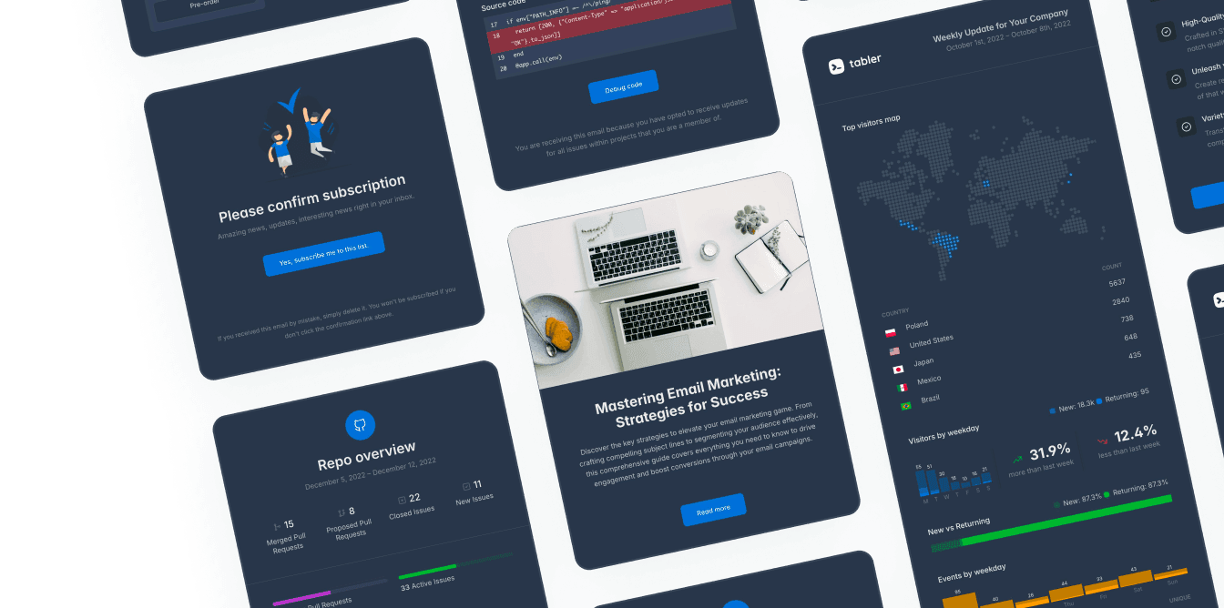
Dark mode deserves the same discipline. Adding a dark background is easy. Keeping muted text readable, chart colors meaningful, focus states accessible and borders clear across every component is the hard part. If dark mode is part of your product direction, pick a system that has thought it through, and test it with real data and real states rather than a clean demo.
Avoid the template trap
Templates can speed a product up, and they can also tempt teams into treating a UI kit as product design. A dashboard full of charts, counters and gradients can look impressive while giving users no clearer path to their work.
Start with the user’s job. If the job is approving invoices, the page should make pending approvals, exceptions and next actions easy to see. If the job is monitoring infrastructure, then hierarchy, status changes and time context matter more than decorative widgets. Use the template to set a level of quality and consistency, then take out anything that doesn’t serve the workflow.
Go easy on customization in the first pass, too. Replacing every color, border radius, icon and component treatment before the product is validated throws away the advantage of picking a system in the first place. Start with the language that’s already there, make deliberate brand changes, and let user feedback tell you where you genuinely need a custom pattern.
Match the license and support to the work
Open-source templates are a good option for students, side projects, prototypes, and teams that want a transparent base they can adapt. An MIT-licensed core lowers the barrier to experimenting and leaves developers room to build without a complicated adoption decision.
For agencies and professional product teams, commercial packages can be worth paying for when they come with expanded assets, precompiled builds, premium illustrations, email templates, updates or priority support. The value isn’t really the extra files. It’s the time you don’t spend hunting for compatible assets, and the uncertainty you avoid when a deadline depends on implementation details.
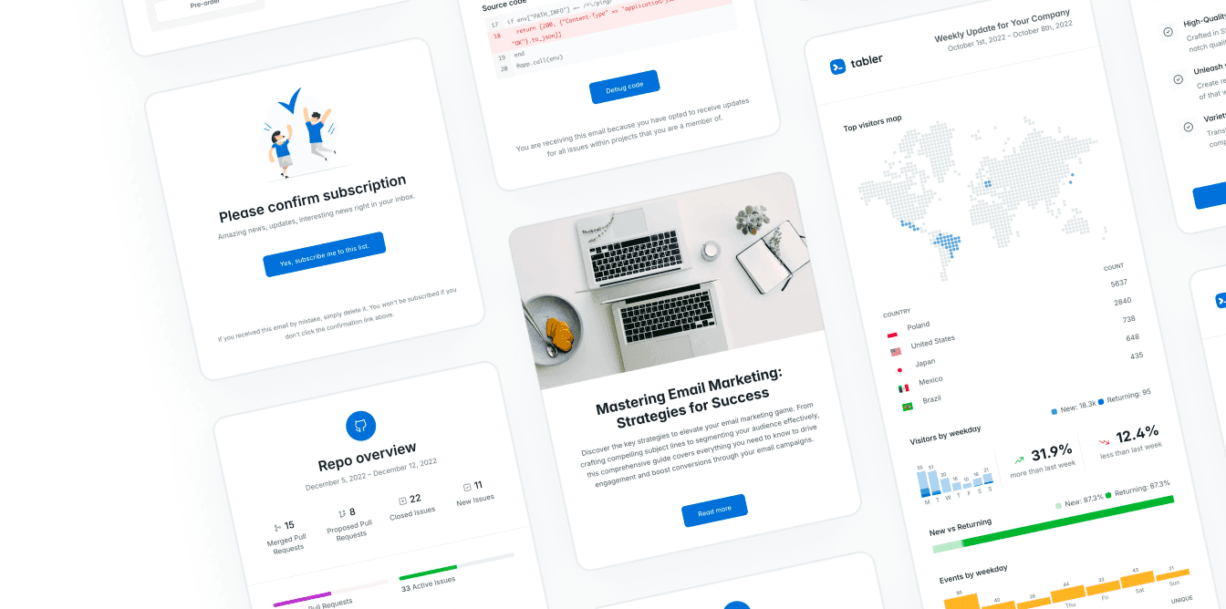
Tabler works on that model: a free, open-source Bootstrap 5 foundation that anyone can use, with professional assets and support for teams that need more coverage. Which one suits you depends on how you deliver, what your team already knows, and how much consistency you need across your product, your marketing and your transactional interfaces.
Build a fast first week
Once you’ve picked a template, don’t start by copying every demo page into your app. Set up the build, establish your theme variables, and implement one representative workflow from end to end. A good first workflow usually includes navigation, a data view, a form, validation, loading behavior and at least one empty or error state.
That small slice tells you whether the template fits your stack and your product before the team commits to dozens of pages. It also gives designers and engineers something concrete to agree on: how page headers work, how destructive actions look, how dense the tables should be, and when a mobile layout should change structure.
The best dashboard templates don’t try to make every interface decision for you. What they do is make the repeatable decisions easier, so your team has time left for the ones users will actually notice.