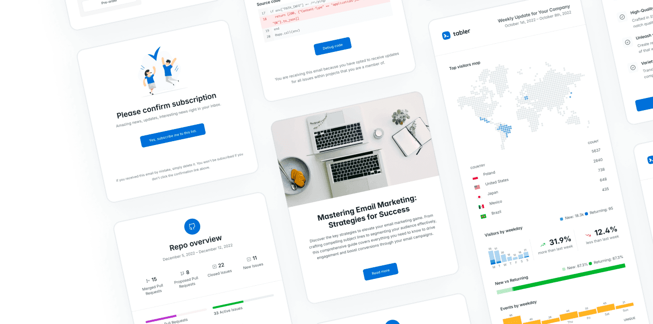
A dashboard rarely stays small. The first screen might show a few metrics, and before long it needs filters, dense tables, user roles, settings, error states and mobile behavior. An MIT licensed dashboard template gives your team a faster start, without pushing the product into a restrictive visual or licensing model.
If you’re building SaaS products, internal tools or data-heavy web apps, that combination is worth having. You start with an interface that already has the patterns an application needs, and you spend your time on product logic, useful workflows, and the details that make the thing feel like yours.
What an MIT licensed dashboard template lets you do
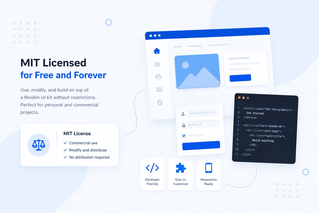
The MIT License is deliberately simple and permissive. In practice it generally lets you use, copy, modify, merge, publish, distribute, sublicense and sell software that includes the licensed template. You can customize the source for a client project, use it inside a paid SaaS product, or adapt it for an administration system only your company will ever see.
The main obligation is just as simple. Keep the copyright notice and the license text in substantial copies of the software. The license also carries a warranty disclaimer, which means the original authors aren’t promising the code will fit every use case or run without trouble in your environment.
That freedom is worth a lot, but it doesn’t mean every file in a project is automatically covered by MIT terms. A dashboard may bundle third-party plugins, fonts, images, chart libraries or icon sets with their own licenses. Read the repository’s license file, the package manifest, the attribution notices and the asset documentation before you ship. That’s ordinary engineering due diligence, not legal advice.
Choose a template for the real work
A polished landing-page kit can look impressive and still fail as an application foundation. Dashboard work isn’t about one hero section. It’s about repeatable decisions across hundreds of states: navigation depth, empty tables, validation messages, pagination, permissions, narrow screens.
Start by looking past the main dashboard view. A useful template makes the common product surfaces feel considered from the first build. Browsing real dashboard template examples is a quick way to see how different products organize their metrics, tables and workflows before you commit to one.
Check the component depth
Look for forms with clear labels, validation styles, input groups, selects, toggles, date controls, file uploads and disabled states. Tables should handle the visual realities of operational software: long values, row actions, sorting controls, status badges, responsive overflow and dense data.
Look at the authentication pages, account settings, invoices or activity views, error pages and empty states as well. Those screens tend to get postponed until late in a project, at which point the visual inconsistency is expensive to fix. Ready-made patterns keep the product moving and still leave room to customize the behavior and the content.
Test responsiveness, not just screenshots
Resize the demo yourself. Side navigation, filter bars, data tables and modal dialogs are where responsive dashboards either work or fall apart. A dashboard doesn’t have to turn every table into a stack of cards on a phone, but it does need a deliberate strategy for overflow, priorities, touch targets and the key actions.
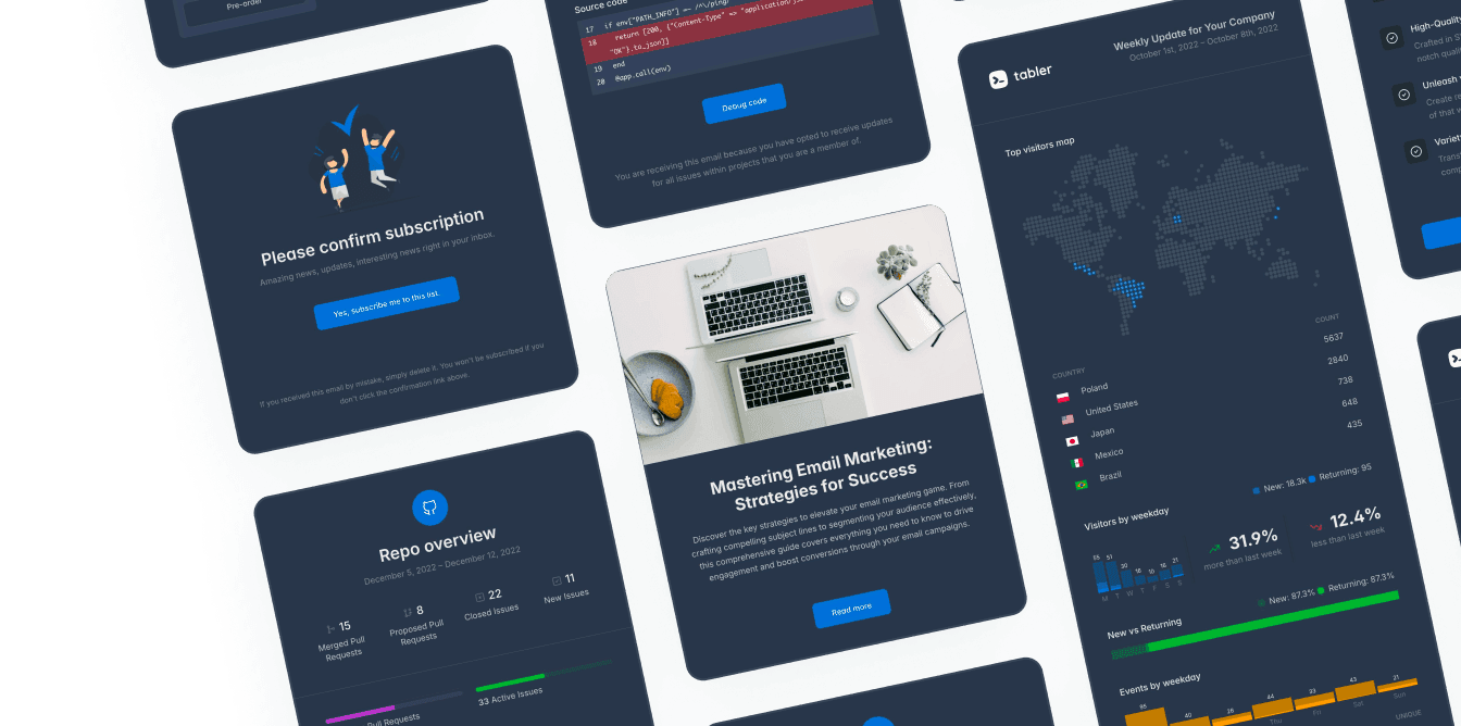
Dark mode deserves the same scrutiny. It’s more than switching a page background. Check contrast on muted text, borders, charts, notifications, form controls and status colors. If your team supports themes, a template with a defined color system saves far more time than a pile of hard-coded color values.
Confirm that the code matches your stack
A familiar foundation means less friction. For teams on Bootstrap 5, a Bootstrap 5 admin dashboard template built around its layout utilities, grid and component conventions is easier to extend than one that brings a competing system along for routine UI work.
Look at the source structure too. Sass variables, organized components, sensible naming and documented build steps make customization predictable. A visually strong template with tangled markup is fine for a quick prototype, and it becomes a burden when several engineers have to maintain it for years.
Design system thinking beats page-by-page styling
The best dashboard template isn’t a finished product design. It’s a consistent set of parts that helps your product become one.
Set your application colors, type scale, spacing, border treatment and elevation rules early. Then apply those decisions across navigation, cards, tables, alerts and forms. When a new workflow turns up, your team composes it from existing patterns instead of arguing about every pixel again.
This is where a free core like Tabler is useful. Its Bootstrap 5 foundation, responsive layouts, dark-mode support and reusable interface components give you a baseline you can build on quickly, without treating design quality as something to sort out later.
Even so, try not to use every available component just because it’s there. A dashboard looks more professional when its visual vocabulary is narrow. Pick one approach to status colors, one primary table pattern and a small number of card styles. Consistency is what makes complex information easy to scan.
Know where free source ends and team needs begin
An MIT-licensed template is often the right answer when you need a capable UI foundation and have the engineering capacity to adapt it. It suits prototypes that need to become production software, student projects, internal operations tools, and products with custom workflows.
Commercial asset packages make sense when your speed depends on more than base HTML and CSS. Agencies may want a central library of premium illustrations, icons, email templates, precompiled builds, updates or priority support. A startup with a short launch window often makes the same call to cut implementation time.
Neither route is automatically better. Free source gives you maximum flexibility and a low barrier to adoption. Paid assets reduce the cost of assembling supporting material and dealing with edge cases. It comes down to your delivery timeline, your design capacity, what support you expect, and how much of the interface your team wants to own directly.
Implement it without creating a theme you can’t maintain
Treat the template as a starting architecture rather than a folder of pages to copy. Install it into your normal build process first, and check that local development, production builds and asset handling all behave. Then set up a small layer of product-specific tokens and component overrides.
A practical rollout usually goes something like this. First, map your first release onto the existing patterns: navigation, dashboard metrics, primary tables, forms, authentication and settings. Then replace the placeholder content with realistic data as early as you can, including unusually long names, empty results, failures and permission-based actions. After that, build reusable application components around the workflows that repeat, rather than duplicating page markup. And write down the decisions your team makes along the way, especially the theme variables, the table conventions and the accessibility requirements.
Real data is the fastest design test there is. A chart that looks clean with seven sample points can turn unreadable with a year of daily activity. A tidy user table can collapse once account names, roles and timestamps arrive from production. Test those conditions before the interface gets hard to change.
Accessibility belongs in this pass too. Check keyboard navigation, visible focus states, semantic labels, error messages that explain how to recover, and contrast that stays readable in each theme. A template speeds up the visual work, and the experience you ship is still your team’s responsibility.
Build for the next feature, not just the first demo
A well-chosen MIT licensed dashboard template takes away the blank-canvas problem and leaves the product in your hands. Use that head start to establish clear patterns, test them against real workflows, and hand your team an interface that’s ready for whatever gets asked for next.