A sign-in screen is often the first product screen a customer, a teammate or an administrator ever sees. On the surface it has one job. It also sets whether the application feels considered and trustworthy. A well-built Bootstrap authentication page template gives you a reliable starting point, so an important user flow doesn’t turn into a one-off design exercise.
For dashboards, SaaS products, internal tools and client portals, it’s worth treating authentication as a whole flow rather than a decorative login card. There are several states to cover, a range of device sizes, accessibility requirements and a few product decisions along the way. Build the page as part of that flow, and keep the visual system easy to customize as the product grows.
Start with the authentication flow, not the login card
A sign-in page usually starts with an email field, a password field and a primary button. Real applications rarely stop there. Users forget passwords, arrive through invitation links, reset credentials, verify email addresses, run into expired sessions, and may need multi-factor authentication.
Before you pick a layout, work out which states your product actually needs. A lightweight internal tool may only need sign-in, password reset and an account-locked message. A customer-facing SaaS app may need registration, single sign-on, two-factor verification, email confirmation and a clear route back to support.
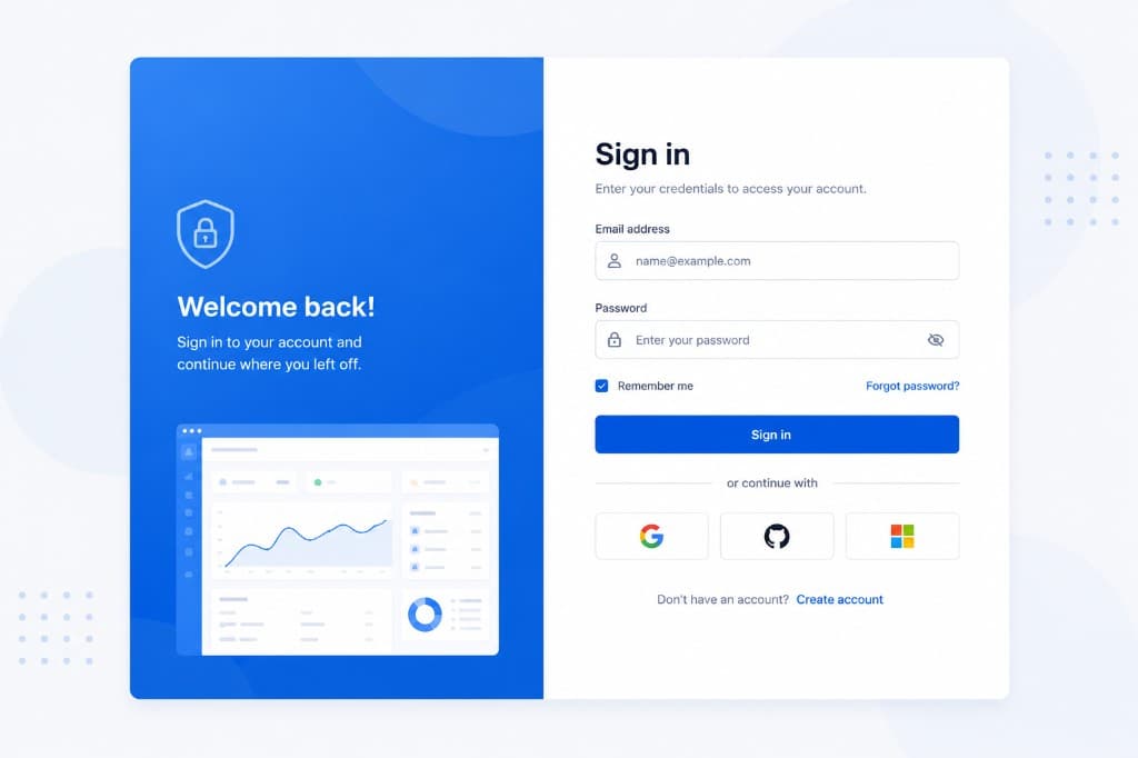
That changes what belongs in the template. A compact centered form is ideal when the task is focused and familiar. A split-screen layout with a product message or an illustration can work well for a new platform where users need some context. The trade-off is attention. Marketing content can reinforce the product, but it shouldn’t distract from the form, and it definitely shouldn’t push the form below the fold on a smaller screen.
Keep the visual hierarchy obvious
The page should answer three questions straight away. Where am I, what do I need to enter, and what happens next? Use a short heading like “Sign in to your workspace”, followed by only the fields that step requires.
The primary action needs the strongest visual weight. Secondary paths, “Forgot password?” and “Create account”, should stay available without competing with the submit button. If you support single sign-on, put it somewhere deliberate. It can go before the credentials when SSO is the expected path for most users, or after a divider when email and password are still the default.
Build the template around reusable parts
Bootstrap gives you the grid, form controls, spacing utilities, buttons, alerts and responsive behavior you need to move quickly. The maintainable part comes from deciding which pieces become shared patterns, instead of copying markup between every authentication page.
Create a consistent page shell first. That shell might include a full-height container, a centered authentication panel, a brand area, a footer for legal text and responsive padding. Keep the card width readable on desktop while letting it expand naturally on narrow screens. A form that’s too wide makes labels and validation messages harder to scan. A form that’s too narrow feels cramped for password managers and long email addresses.
Then standardize your field pattern. Every input should use the same label treatment, the same help text placement, the same invalid feedback behavior and the same spacing. Password visibility controls, if you have them, need accessible names and a predictable position. Try not to lean on placeholder text as a label. Placeholders disappear as users type, and they don’t give many assistive technologies the same clarity.
A reusable authentication template should define the common feedback states too. Use an alert for a page-level problem, like invalid credentials or a session timeout. Use inline validation when one specific field needs correcting. Those are different messages, and treating them the same way just confuses people.
Make responsive behavior part of the design
Authentication pages get opened from unexpected places: a mobile browser after an invitation email, a tablet on a warehouse floor, a small laptop window next to some documentation. Responsive design isn’t something you bolt on at the end.
Start with a single-column mobile layout. Make sure the fields and buttons are big enough to tap comfortably, keep generous side padding, and avoid fixed heights that make content disappear when the mobile keyboard opens. The submit button should still be easy to find after a validation error adds a line of text below an input.
At larger breakpoints you can bring in a two-column composition, more product context, or an illustration panel. Just don’t make that secondary panel necessary for understanding the flow. On mobile it should be removable, or able to move below the form, without weakening anything.
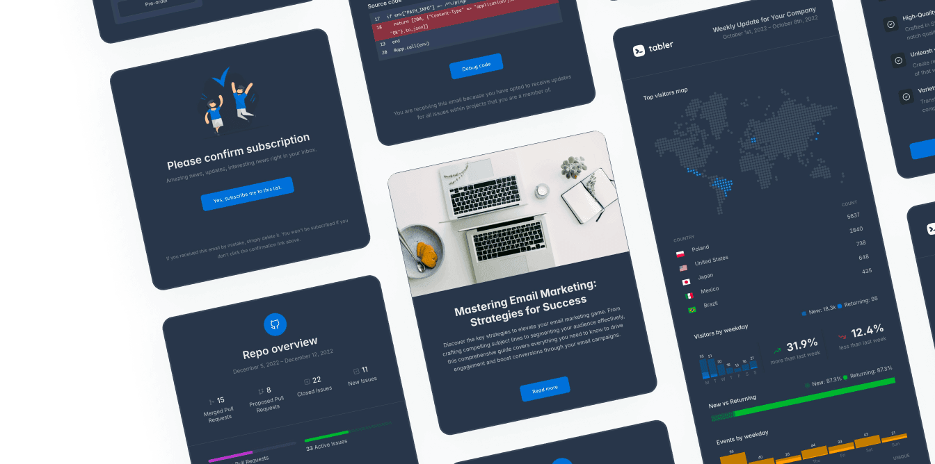
Dark mode deserves the same attention. Authentication screens tend to be full of muted text, low-contrast borders, disabled buttons and third-party provider buttons, and all of those are places where a dark palette gets hard to read. Define colors through Sass variables or design tokens, so backgrounds, borders, input states and alerts change together instead of being patched one selector at a time.
Test the states that tend to break
A polished default screen can hide weak edge cases. Test long error messages, translated labels, a password manager filling both fields, keyboard-only navigation, browser zoom and reduced-motion preferences. Check what happens when the user submits the form twice, loses connectivity, or comes back from an expired reset link.
None of that is a rare exception. Those are the moments when users decide whether an application feels dependable.
Accessibility is a product requirement
A clean interface isn’t automatically an accessible one. Every input needs a visible label associated with the control. Validation feedback has to be programmatically connected where that applies, and errors shouldn’t rely on red text alone. Add an icon, or clear language like “Enter a valid work email address.”
Keyboard behavior matters just as much. Users should be able to move through the page in a logical order, see a clear focus indicator, open and close the password visibility control, and submit without reaching for a mouse. When an error appears after submission, give a useful summary, or move focus somewhere that helps people work out what needs attention.
Be careful with social sign-in buttons. A provider logo on its own isn’t enough. The button should state the action, something like “Continue with Google”, and keep enough contrast in both light and dark themes. The same goes for captcha controls, consent checkboxes and recovery links.
Separate interface quality from authentication security
A frontend template can make an authentication flow clear and consistent, but it doesn’t secure the underlying system. The HTML and the Bootstrap components are the presentation layer. Password hashing, session handling, rate limiting, CSRF protection, identity provider configuration and secure cookie settings all belong in the application architecture.
That distinction saves teams from a common mistake, which is treating a complete-looking sign-in page as a complete authentication implementation. Pair the interface with server-side validation, generic error messages where they’re needed, and a recovery process that doesn’t reveal whether a particular email address has an account.
“If an account exists for this email, you’ll receive reset instructions” is usually safer than confirming the account status. The UI can still help people along the way, by showing loading states, preventing accidental duplicate submissions, and explaining what happens next once a request succeeds.
Customize without creating a maintenance problem
The fastest template isn’t the one with the most visual effects. It’s the one your team can adapt six months later without untangling duplicated CSS and inconsistent components.
Use Bootstrap variables and Sass customization for the recurring choices: brand color, border radius, typography scale, shadows, spacing. Keep the overrides close to the design system rather than scattering custom values across individual authentication pages. If your product has several brands or white-label instances, this is what makes theme changes manageable.
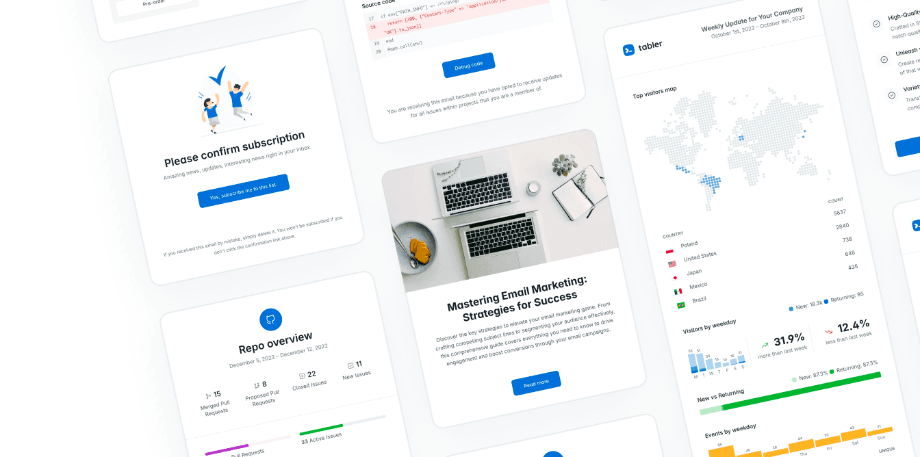
Use illustrations and visual accents sparingly. They can give a sign-in screen some personality and make the product feel more finished. But a large image that delays rendering, pulls attention off the form, or turns unreadable in dark mode is working against the flow. Ready-made authentication layouts from a system like Tabler cut down the setup time and still leave the structure fully customizable.
Give every state the same level of care
The best authentication experience is usually a quiet one. Users don’t end up thinking about alignment, button behavior, error recovery or which screen comes next, because the right action is obvious at every step.
Build the page as a small system rather than a single screen. When the layout, the form patterns, the responsive rules and the recovery states all work together, authentication stops being a rushed gateway and turns into a dependable first interaction with your application.