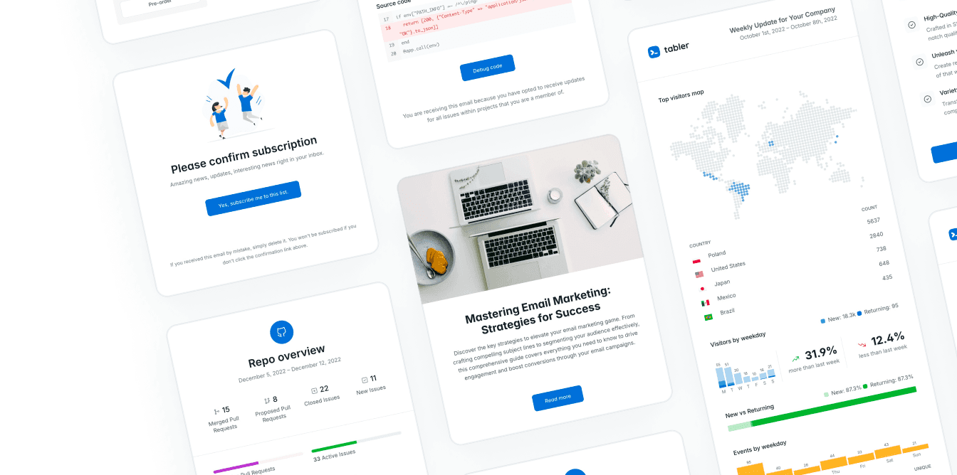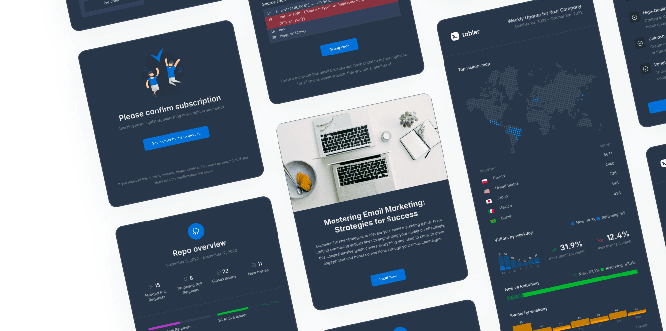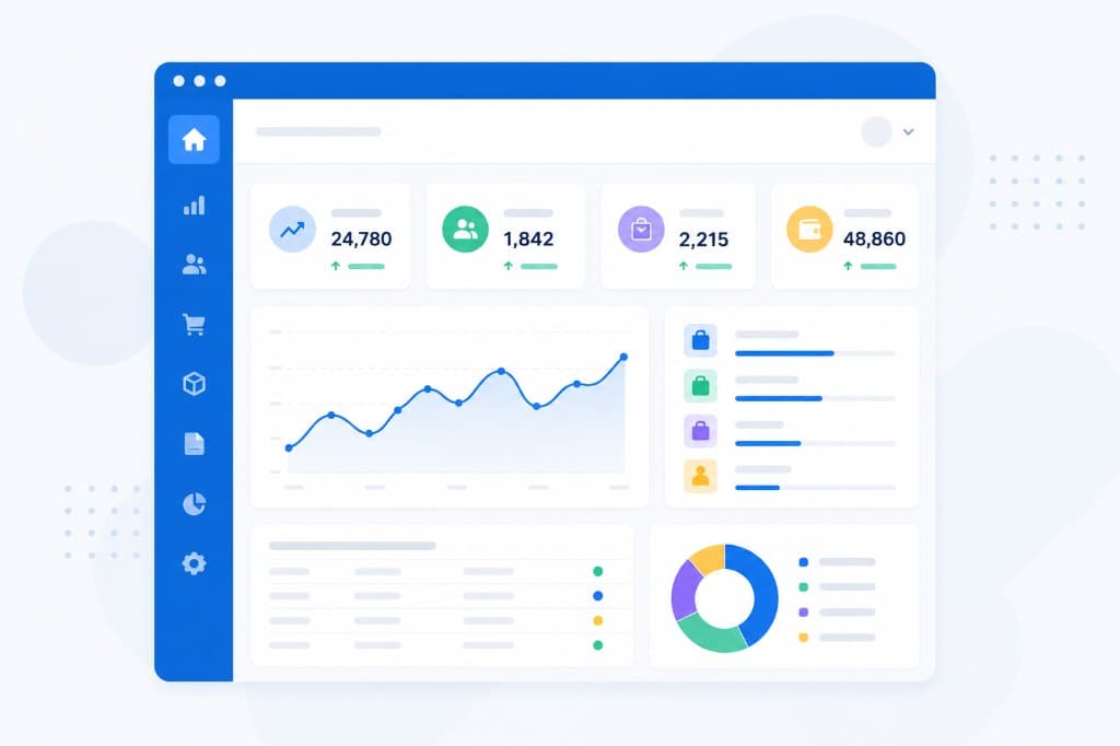
A dashboard can have every chart your product supports and still leave users asking, “What needs my attention?” The best dashboard template examples answer that in seconds. They give each audience a clear starting point, they organize dense information without the visual noise, and they set a UI pattern the rest of the application can follow.
For developers and product teams, the job is to pick a layout that matches a real workflow, then build it out of reusable components that hold up as data, permissions and features grow. Copying a polished screenshot won’t get you there.
What good dashboard template examples have in common
A useful dashboard starts with hierarchy. The page leads with the most meaningful status, metric or action, and the supporting detail comes after. In practice that’s often a small group of KPI cards at the top, a primary chart or task panel in the middle, and tables or activity feeds further down. A dense layout can work for power users, but only when the grouping, spacing and labels make it easy to scan.
Good examples respect context, too. A founder checking monthly revenue needs a different view from a support manager working an active queue. One needs trend comparisons and forecasts. The other needs urgency, ownership and filters. Reusing the same card grid for both saves development time up front and makes the product less useful.
Responsive behavior matters just as much. On smaller screens, secondary metrics should drop below the primary signal, wide tables need a deliberate responsive treatment, and filters have to stay reachable without taking over the page. A template gives you the foundation, but your data model and your users’ workflow make the final calls.
10 dashboard template examples for real products
1. SaaS product overview dashboard
A SaaS overview dashboard is home base for account owners. Use it to show active users, subscription status, feature adoption, usage limits and recent account activity. A compact usage chart helps customers see whether they’re getting close to a plan limit, and a well-placed upgrade or billing action supports the next step without interrupting whatever they came to do.
Try not to treat this as a generic analytics page. If a customer signs in to get work done inside your product, their current tasks belong above the vanity metrics.
2. Executive revenue dashboard
Revenue dashboards need to be quick to read. Lead with recurring revenue, net revenue retention, pipeline value and forecast variance. Then use a trend chart for movement over time, and a comparison state to show whether a metric is ahead of or behind the previous period.
Keep the time range visible and consistent across the page. Executives compare this month, this quarter and year to date, so an ambiguous date filter creates doubt you don’t need. Detailed deal tables can sit below the primary view or behind a drill-down.
3. E-commerce operations dashboard
An operations dashboard connects orders to the work needed to fulfill them. The high-priority cards might cover new orders, unfulfilled orders, return requests, low-stock items and shipping exceptions. The center of the page can focus on fulfillment volume or order status, and a table gives the operations team a queue to work through.
Use color to signal exceptions rather than to decorate every metric. Save the warning and danger states for late shipments, inventory risks and payment problems. That’s what makes the interface scannable during a busy period.
4. Marketing performance dashboard
Marketing teams need to compare channels without losing the link between spend and outcomes. A practical layout puts spend, leads, conversion rate, cost per acquisition and attributed revenue together. Add filters for channel, campaign, audience and date range, and keep the selected context obvious in the chart labels and table headings.
There’s a trade-off here. Attribution data gets complicated, and a dashboard has to stay readable. Show the reporting model everyone has agreed on and let the deeper analysis happen somewhere else. A dashboard should leave people confident about what they’re looking at.
5. Customer support dashboard
Support teams work from queues, so the dashboard has to make workload and risk visible immediately. Show open tickets, first-response performance, SLA breaches, unresolved high-priority cases and agent availability. A recent-ticket table with status, assignee, priority and last update usually ends up being the most useful thing on the page.
A volume chart still earns its place when it helps managers spot a pattern, like a sudden spike after a release. But agents shouldn’t have to scroll past charts to find the next customer request.
6. Project management dashboard
A project dashboard should answer three questions. What’s in progress, what’s blocked, and what’s due next? A balanced layout might include project health cards, a milestone timeline, a workload chart and a focused list of overdue or blocked tasks.
For teams running a lot of projects, filters are essential. Let users narrow by owner, client, team or status. For a single project, keep it simpler. Show the milestones, decisions, risks and current task list rather than recreating a portfolio view.
7. Internal admin dashboard
Internal tools often need more density than customer-facing products. Administrators may manage users, roles, billing records, content, system settings and audit events from the same application. Start with a short system summary, then favor actionable tables and quick filters over decorative charts.
Permissions should shape the UI from the beginning. A support agent, a finance administrator and a platform owner may share the same shell while needing different navigation and different dashboard content. Role-aware layouts cut the clutter and lower the risk of somebody triggering the wrong action.
8. Security monitoring dashboard
Security dashboards work best when they separate normal activity from exceptions. Show the current risk level, active incidents, failed authentication attempts, unusual location events and unresolved alerts. A timeline helps with understanding sequence, and an alert table supports the investigation.
Don’t rely on color alone to show severity. Pair the visual states with labels, icons and short descriptions, so the dashboard still makes sense in dark mode, on a poor display, and for users with different accessibility needs.
9. Inventory and logistics dashboard
Inventory teams need a view of stock health across locations, suppliers and demand cycles. Useful top-level indicators include stock on hand, items below the reorder point, incoming purchase orders, backorders and fulfillment delays. A location comparison chart exposes uneven stock distribution, and a detailed SKU table supports the follow-up.
The right level of detail depends on who’s looking. Warehouse managers may need bin-level exceptions, while operations leaders only need category-level trends. Use progressive detail, so each group can move from status to action without starting over.
10. Personal productivity dashboard
A personal dashboard is less about reporting and more about focus. It can combine today’s agenda, priority tasks, recent documents, project updates and simple progress indicators. The best version of this feels calm, mostly because it limits the number of panels competing for attention.
This pattern is especially useful in collaborative software where people come back several times a day. Make the next action obvious, keep the context from recent work, and leave out metrics that don’t help somebody finish a task.
Choose a template around the workflow
Before you pick a dashboard layout, decide what the first decision is that a user should make after signing in. That decision tells you whether the page needs a KPI grid, an alert queue, a schedule, a data table or a progress view. From there, work out which components you’ll reuse across the application: cards, filters, tabs, avatars, badges, charts, dropdowns and responsive tables.
A well-designed Bootstrap 5 template shortens the path from wireframe to production, because the layout, the navigation patterns and the interface states already share a visual system. Tabler is that kind of foundation, with reusable components and Sass customization for teams that want a polished interface without rebuilding the common UI patterns.
Choose the breadth carefully. A template with dozens of pages and components is worth it when your application has several workflows and a long roadmap. For a focused internal tool, a smaller component set is easier to maintain. The best choice gives your team a consistent starting point and still leaves room for the parts of the product that are genuinely yours.
Start with the dashboard your users need on a busy Tuesday. When the hierarchy reflects the actual work, the interface gets easier to build and extend, and it stands a much better chance of becoming something people open every day.