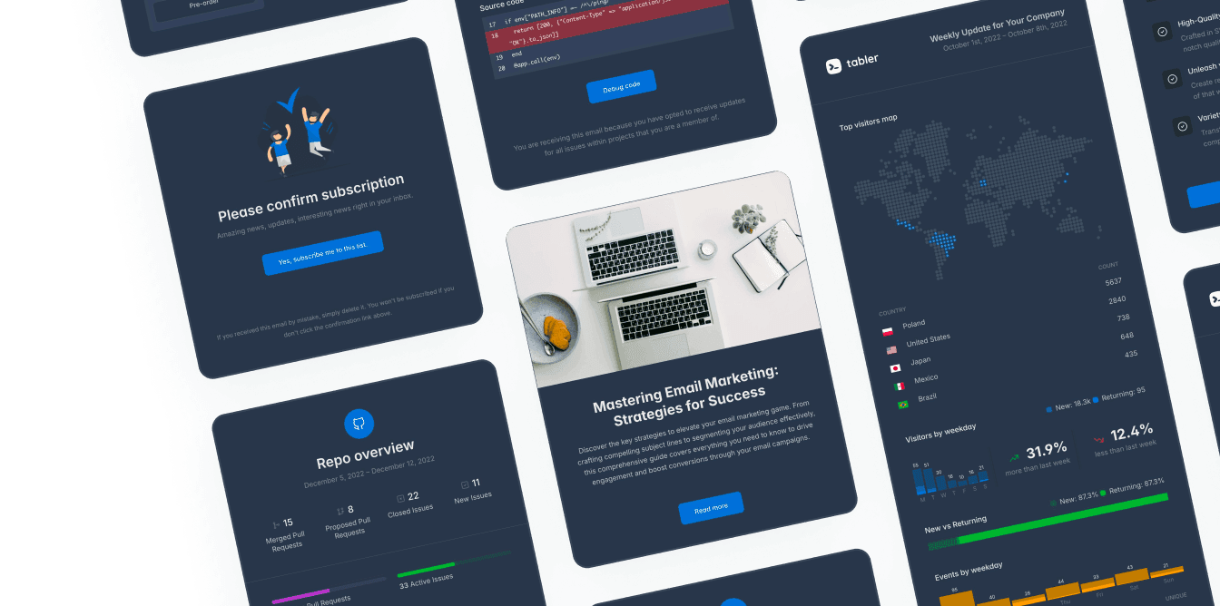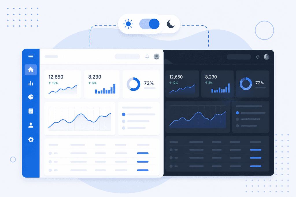
Dark mode usually gets requested as a small visual feature. Then it turns into a long tail of bugs.
Buttons and cards switch over fine, Bootstrap 5 handles those on its own. But then a chart renders black text on a dark canvas. A customer logo is sitting inside a glowing white box. Every card loses its edges, because shadows are more or less invisible on a dark background. And the whole page flashes white for 200ms on every reload.
None of these are really color problems. They’re theming problems.
Dark mode works when every color in your dashboard comes from a variable, and it breaks in every place where somebody wrote a hex value down by hand. This guide covers the mechanism, a switcher that doesn’t flash, and the parts of an admin interface that usually need extra work.
How Bootstrap 5 color modes work
Bootstrap 5.3 replaced the old “build a second stylesheet” approach with a single attribute. Setting data-bs-theme swaps the CSS custom properties that every component reads:
<html lang="en" data-bs-theme="dark">
Components don’t carry hardcoded colors anymore. A card’s background is var(--tblr-bg-surface), body text is var(--tblr-body-color), and the dark theme just redefines those variables further down the cascade. The components themselves don’t need to know which theme they’re in. Nothing re-renders, and no stylesheet gets swapped out.
Because it’s an attribute and not a global flag, it also nests. Any element can open its own color context:
<body data-bs-theme="light">
  <div class="card" data-bs-theme="dark">
    <div class="card-body">This card stays dark on a light page.</div>
  </div>
</body>
That’s genuinely handy in a dashboard. You can put a dark sidebar next to a light content area, or drop a dark code preview panel into an otherwise light page, without writing a single override.
There’s one more thing the attribute does, and it’s easy to miss. It also sets the CSS color-scheme property, and color-scheme: dark is what tells the browser to draw its own UI in dark variants, so scrollbars, the internals of form controls, date pickers and the canvas behind your page all follow along. Skip it and you end up with nice dark cards and bright white scrollbars.
Turning it on in Tabler
Tabler ships both themes in the same CSS file, so dark mode doesn’t need an extra build step. The attribute on its own is enough:
<html lang="en" data-bs-theme="dark">
The template also comes with a small theme script that reads a URL parameter and remembers the choice:
<body>
  <script src="./dist/js/tabler-theme.min.js"></script>
Loading ?theme=dark sets the attribute and writes tabler-theme to localStorage, and every visit after that restores it. The same mechanism drives four other appearance settings, each with its own attribute and storage key:
| Setting | Attribute | Values |
|---|---|---|
| Color mode | data-bs-theme | light, dark |
| Neutral palette | data-bs-theme-base | gray, slate, zinc, neutral, stone |
| Accent color | data-bs-theme-primary | blue, azure, indigo, purple, green, and more |
| Corner radius | data-bs-theme-radius | 0–1.5 |
| Font | data-bs-theme-font | sans-serif, serif, monospace |
There’s one thing to keep in mind before you rely on it. The bundled script defaults to light and doesn’t follow the operating system setting, so if you want system-aware behavior you’ll have to write that part yourself. It’s about fifteen lines.
A switcher that doesn’t flash
The flash of the wrong theme happens for a fairly mundane reason. The browser paints the default light page before your JavaScript has had a chance to run. Deferred scripts, bundled scripts and anything loaded at the end of <body> are all too late.
What usually works is a small blocking script, inlined in <head>, before the browser has a chance to paint anything:
<head>
  <script>
    (function () {
      const stored = localStorage.getItem('theme'); // 'light' | 'dark' | 'system' | null
      const system = window.matchMedia('(prefers-color-scheme: dark)').matches ? 'dark' : 'light';
      const theme = !stored || stored === 'system' ? system : stored;
      document.documentElement.setAttribute('data-bs-theme', theme);
    })();
  </script>
  <link rel="stylesheet" href="./dist/css/tabler.min.css" />
</head>
Yes, that’s a render-blocking inline script. That’s okay here. It runs in well under a millisecond, and it saves you a visible flash on every single navigation.
It’s also worth storing three states. “Light”, “dark” and “system” are three different answers, and it’s tempting to collapse “system” down to whichever value it happens to resolve to at the time. Don’t. A user who explicitly picked follow my system would then stop following it after the first sunset:
function setTheme(choice) {
  localStorage.setItem('theme', choice); // 'light' | 'dark' | 'system'
  applyTheme();
}

function applyTheme() {
  const stored = localStorage.getItem('theme') || 'system';
  const system = window.matchMedia('(prefers-color-scheme: dark)').matches ? 'dark' : 'light';
  document.documentElement.setAttribute('data-bs-theme', stored === 'system' ? system : stored);
}

// Follow the OS while the tab is open, but only when the user picked "system".
window.matchMedia('(prefers-color-scheme: dark)').addEventListener('change', applyTheme);
If your dashboard is server-rendered and your users are logged in, it’s worth persisting the choice on the user record as well, and rendering the attribute server-side. localStorage only lives on one device. An account-level preference follows people to their second machine.
What dark mode breaks
Everything above takes an afternoon. The rest of the week tends to go into the things below.
Charts
Charting libraries draw into a canvas, or generate their own inline SVG, with their own color options. They don’t know anything about your CSS variables, so axis labels, gridlines and tooltips keep their light-theme colors on a dark background.
The usual fix is to read the computed variables at render time, and re-render the chart when the theme changes:
function chartColors() {
  const styles = getComputedStyle(document.documentElement);
  return {
    text: styles.getPropertyValue('--tblr-body-color').trim(),
    grid: styles.getPropertyValue('--tblr-border-color').trim(),
    primary: styles.getPropertyValue('--tblr-primary').trim(),
  };
}
Then use those values in your chart options, and rebuild the chart from the same function that flips the attribute. If your toggle lives far away from your chart code, a MutationObserver on the attributes of documentElement generally works well.
Images and logos
Screenshots, customer logos, illustrations and any PNG with a white background baked into it all turn into bright rectangles. There are roughly three ways to deal with this, in order of preference.
The best result, and the most work, is to ship both variants and swap them with CSS: [data-bs-theme="dark"] .logo-light { display: none; }.
The next option is SVG with fill="currentColor", so the artwork just inherits the text color. That’s one of the reasons an icon set built on currentColor needs almost no dark-mode work at all.
As a last resort you can soften the offending image with [data-bs-theme="dark"] .logo { filter: brightness(.9); }. I wouldn’t blanket-invert images, though. Photos and screenshots come out looking like negatives from a particularly gloomy photocopier.
Elevation
Shadows communicate depth by darkening the surface underneath an element. On a dark background there isn’t much left to darken, so drop shadows more or less disappear and every card ends up floating in the same plane.
Dark interfaces tend to express hierarchy with lighter surfaces and visible borders instead. That’s what --tblr-bg-surface and --tblr-border-color already do in the dark theme, as long as your own components use them and not a hardcoded box-shadow.
Contrast
Pure white text on pure black is the classic mistake. Maximum contrast causes halation, where the light text visibly bleeds at the edges and long reading sessions get tiring. That’s why Tabler’s dark theme uses #e5e7eb on #111827.
Colors tuned for a light background often fail in the other direction. A mid-tone text-warning that hits 4.6:1 on white can drop below 3:1 on a dark surface. So semantic colors need checking in both themes. Run the contrast audit twice, and treat the dark pass as a job of its own.
Everything embedded
Third-party widgets, maps, iframes, syntax highlighters and rich-text editors come with their own theming, and won’t follow your attribute. Each of them needs its own theme prop, hooked up to the same state.
Transactional email is in the same category. Your app’s dark mode has no effect there at all, and HTML email dark mode follows a completely different set of rules.
A testing checklist before you ship
Dark mode regressions like to hide in the states nobody screenshots. It’s worth walking both themes through:
- Empty, loading and error states. Skeletons and placeholder illustrations are very often hardcoded gray.
- Disabled and read-only form controls. The usual “gray it out” approach can leave the text unreadable.
- Hover, focus and active states. Focus rings tuned for light backgrounds often disappear on dark ones, and keyboard navigation has to stay visible in both themes.
- Toasts, modals, dropdowns and tooltips. Anything rendered into a portal at the end of
<body>can escape a scopeddata-bs-themecontext. - Tables with status badges, since tables are usually where most of the semantic colors end up.
- Print. It’s easier to force a light context in your print stylesheet than to explain to someone why their printer just went through half a toner cartridge.
The practical order of work
If you’re retrofitting dark mode into a dashboard that already exists, here’s the order I’d do it in.
First, grep your own CSS for hex values and replace them with Tabler’s CSS variables. That’s the actual migration. Once it’s done, adding the attribute is trivial.
Then add the blocking script and the three-state toggle, and ship that to your own team first, so the audit happens in real use.
After that, fix the charts and the images. Those two generally won’t fix themselves.
Next, run the contrast checks in dark mode as a separate pass.
Finally, add both themes to your review checklist, so new screens don’t start reintroducing hardcoded colors.
Dark mode only stays cheap if it stays a variable system. Every hardcoded color is a future bug waiting to show up in one of the themes. And it’s usually the theme nobody happened to be looking at when the feature was tested.
If you’d rather start from a baseline where both themes are already consistent across every component, the Tabler admin template ships them together, and the customization docs cover the variables to build on.