Icons look like a small decision until the codebase has three hundred of them. The choice you made in week one, whether that was inline markup, imported files, a sprite sheet or a component library, is what decides how easy it is to change a color in dark mode, how much dead weight ships in your bundle, and whether screen readers read something sensible out to your users.
Using SVG icons well in React isn’t really about any one technique. It’s about picking the approach that matches how your product is going to grow.
This guide goes through every practical way to render SVG icons in a React application, compares the trade-offs, and shows the patterns that keep icons easy to style and accessible.
Why SVG won the icon format war
Before SVG became the default, interfaces shipped icons as PNG sprites and icon fonts. Both are more or less legacy now, and the reasons why are a decent guide to what matters in a modern setup.
Raster sprites blur on high-density displays, and every color variant needs its own image. Icon fonts scale cleanly, but they cost you elsewhere. They render as text, so a failed font load produces broken characters. Anti-aliasing can make the strokes look soft. And accessibility tooling has a hard time with private-use Unicode characters.
SVG has none of those problems. It’s resolution-independent, you can style it with plain CSS, you can animate it, and it lives in the DOM, where ARIA attributes work properly. The only question left is how to get SVG markup into your React components, and that’s where teams start to disagree.
The four ways to render an SVG icon in React
1. Inline SVG in JSX
The most direct approach is pasting the SVG markup straight into a component:
function HeartIcon() {
  return (
    <svg
      xmlns="http://www.w3.org/2000/svg"
      width="24"
      height="24"
      viewBox="0 0 24 24"
      fill="none"
      stroke="currentColor"
      strokeWidth="2"
      strokeLinecap="round"
      strokeLinejoin="round"
    >
      <path d="M19.5 12.572l-7.5 7.428l-7.5 -7.428a5 5 0 1 1 7.5 -6.566a5 5 0 1 1 7.5 6.572" />
    </svg>
  );
}
Inline SVG gives you full CSS control. stroke="currentColor" means the icon inherits the text color around it automatically, which is probably the single most useful trick in icon styling.
The downside is maintenance. Hand-pasted markup drifts. One icon ends up with stroke-width="2" and another with 1.5, attribute casing gets mistranslated from HTML to JSX, and updating an icon means finding and replacing raw paths.
Inline SVG is fine for one or two bespoke icons, a custom logo mark for instance. It doesn’t scale to an icon system.
2. Importing SVG files with SVGR
SVGR converts .svg files into React components at build time, and it’s what handles SVG by default in a lot of toolchains:
import HeartIcon from './icons/heart.svg?react';

function LikeButton() {
  return (
    <button>
      <HeartIcon aria-hidden="true" />
      Like
    </button>
  );
}
This keeps the icon source files as plain SVG. Designers export from Figma, developers import the file, and you still get real components you can pass props to.
The catch is configuration. The import syntax differs between Vite, webpack and Next.js, and the pipeline is yours to own. Cleaning up exported SVGs becomes your team’s job: stray fill attributes, editor metadata, fixed width and height. SVGO helps, but somebody has to maintain the config.
SVGR is the right choice when your product uses genuinely custom iconography that no library provides.
3. SVG sprites with <use>
A sprite collects every icon into one SVG file of <symbol> elements, referenced by ID:
function Icon({ name, size = 24 }) {
  return (
    <svg width={size} height={size} aria-hidden="true">
      <use href={`/sprite.svg#${name}`} />
    </svg>
  );
}

<Icon name="heart" />
Sprites are good in one specific situation, which is pages that render hundreds or thousands of icon instances. The browser parses each symbol once and references it after that, so the DOM stays light, and the sprite file caches separately from your JavaScript bundle.
The trade-offs are a build step to generate the sprite, no per-instance access to the icon’s internal nodes, and icon names as strings, which means a typo renders nothing at all and TypeScript can’t catch it.
4. An icon component library
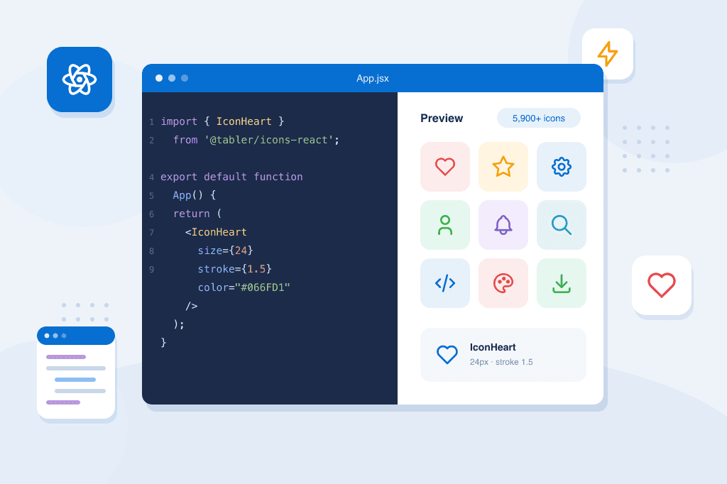
For most products, the practical answer is a maintained icon library with proper React support. With Tabler Icons, which is free and open source and has over 5,900 icons drawn on a consistent 24×24 grid, the setup is a single install:
npm install @tabler/icons-react
import { IconHeart, IconSettings, IconUser } from '@tabler/icons-react';

function Toolbar() {
  return (
    <nav>
      <IconHeart size={20} stroke={1.5} />
      <IconSettings size={20} stroke={1.5} />
      <IconUser size={20} stroke={1.5} />
    </nav>
  );
}
Every icon is a typed component, so autocomplete shows you the whole set, and a misspelled name fails at compile time instead of rendering an empty box. You get consistency for nothing, since every icon shares the same grid, the same default stroke width and the same prop API. That’s exactly the discipline that hand-managed icon folders tend to lose over time. The React package documentation has the full prop reference.
A library also solves a problem you probably haven’t hit yet, which is the forty-seventh icon. With inline SVG or SVGR, every new icon is a small sourcing-and-cleanup job. With a library, it’s one more import.
Styling icons: color, size and stroke
However the icons get into your app, styling works best when you lean on inheritance instead of hardcoding things.
Color
Stroke-based icons that use currentColor inherit the CSS color of their parent. So an icon inside a danger button turns red without a line of icon-specific CSS, and dark mode works on its own wherever your text colors already adapt:
<span style={{ color: 'var(--color-danger)' }}>
  <IconTrash aria-hidden="true" />
  Delete
</span>
If you find yourself passing explicit hex colors to individual icons, that’s usually a sign the component around them should own the color instead.
Size
Match the icon size to the text next to it, roughly 1em to 1.25em for inline use, commonly 16–20px in buttons and 24px standalone. Try not to mix arbitrary sizes across the interface. Two or three sanctioned sizes keep screens visually calm.
Stroke width
Outline icon sets expose stroke width as a prop. Thinner strokes, 1.25 to 1.5, read as lighter and more refined at large sizes, while the default 2 holds up better at small ones. Pick one value per context and stick to it. Mixed stroke widths sitting side by side are one of the fastest ways to make a UI look unpolished.
Keeping the bundle small
The usual worry about icon libraries is whether importing from a 5,900-icon package will bloat your bundle. It won’t, as long as the imports are tree-shakeable, and modern icon packages are. Import IconHeart and the bundler includes that one component, not the library.
There are two real pitfalls, though.
Dynamic icon names defeat tree-shaking
Code like Icons[iconName] after importing the whole namespace forces the bundler to keep every icon, because it has no way of knowing at build time which ones you need. If your icon names really do come from data, a CMS or user configuration, build an explicit map of the icons your product actually uses:
import { IconHome, IconChartBar, IconSettings } from '@tabler/icons-react';

const NAV_ICONS = {
  home: IconHome,
  analytics: IconChartBar,
  settings: IconSettings,
};

function NavIcon({ name }) {
  const Icon = NAV_ICONS[name];
  return Icon ? <Icon size={20} aria-hidden="true" /> : null;
}
Barrel-file re-exports can drag in more than you use
If your internal components/index.js re-exports an icon-heavy module, some bundler configurations lose the ability to shake it out. Importing icons directly where they’re used avoids the problem.
For screens that really are icon-dense, an icon picker, or a big data table with a status icon on every row, the sprite approach from earlier can sit alongside a component library rather than replace it.
Accessibility: decorative vs meaningful
Every icon in your interface is one of two things, and each needs different markup.
Decorative icons sit next to text that already carries the meaning. An icon beside a “Settings” label adds nothing for a screen reader, so hide it:
<button>
  <IconSettings aria-hidden="true" />
  Settings
</button>
Meaningful icons stand on their own, most often in icon-only buttons. The icon itself still stays hidden from assistive technology, and the accessible name goes on the interactive element:
<button aria-label="Delete item">
  <IconTrash aria-hidden="true" />
</button>
What you want to avoid is the middle ground, an icon-only control with no label at all, or an aria-label stuck on the SVG instead of on the button. I’d audit your icon-only buttons first. That’s where most icon accessibility bugs live.
A practical default
If you’re starting a React project today, here’s the setup that serves most teams.
Start with a component icon library as the base. Consistent grid, typed imports, tree-shakeable. Tabler Icons for React is free and MIT-licensed, and it covers the great majority of interface needs.
Then use currentColor everywhere, so icons inherit color from their context and theming and dark mode stay in one place.
Use SVGR for the handful of custom icons your brand genuinely needs, cleaned through SVGO and drawn on the same grid as your library, so they sit next to library icons without looking out of place.
And put aria-hidden on decorative icons and aria-label on icon-only controls, enforced in code review or with a lint rule.
Icons are one of the most repeated elements in any interface. The same small decisions get made hundreds of times, so it’s worth making them once and writing them into your components and conventions. The rest of the product then inherits the consistency without anybody having to think about it. If you want to see this applied across a whole interface, the Tabler admin template uses this exact icon system in every screen and component.